


Wednesday 3rd February, 8pm, Sky Arts. That's when I'll be appearing as a wildcard. Best…
Lullaby For The Summer
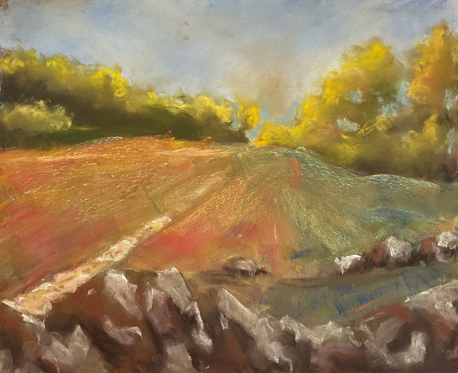
I didn’t use the soft pastels at all during September so thought I’d better get them out today. I picked a scene from Queendown Warren that’s been in my photo pile for a while but adapted it to today’s conditions with a blue/grey sky and the first signs of autumn colours starting to appear in the trees.
There are four planes to this one: the sky, the trees, the hillside and the rocks. Needless to say, I worked from the back to the front. I started by gently putting in the treeline shape and hill shape with the edges of yellow and orange pastels respectively. Then I got to work on the sky. No flashy warm colours today: just some blues and whites plus cream, burnt sienna and something that might have been raw sienna. I did most of the blending with soft fingers but used colour shapers on the edges of the clouds. Pretty straightforward.
Then came the trees. Yellows and a bit of orange on the top, then greens, then dark greens and browns the bottom. Being in an especially loose mood, I probably threw in some blues and reds too. Most of these were blended with fingers but again I used the colour shapers at the extremes. I didn’t leave a gap in the middle for the path or sky holes in the foliage, so added these afterwards and blended them in with the colour shapers.
A lot of layers of colour went into the hillside. Most of the layers were added with marks radiating out from the top of the the hill. I wanted to finish up with my favourite orange/green combination, so a lot of these layers were green or orange. But I also used lots of yellow along the top, red on the left, blue on the right and purple in between. Every time I added a layer, the new colour looked great but an earlier colour was drowned out, so I would add back the missing colour. At one point I tried blending the colours with my finger but didn’t like the muddy colour it created, so decided that there would be no more blending on the hillside. I stopped when the tooth of the paper started to feel close to full and ended up with a neutral green with a bit of red and blue showing but little or no orange. Oh well.
The hillside was feeling a bit boring, so I thought I’d better add something more. I tried adding a dog walker without success, so blended him out. And instead I added a horizontal row of rocks to break the monotony of the radiating lines. I only used four colours for the rocks: a white, a brown, a light mauve and sepia. I did some minimal blending with the colour shapers, looking to keep some hard edges. And that was me done.
What to say about this one? The sky, trees and rocks are all great. Even the hillside looks good, although it would have been better without the blending and with more orange showing. But something’s not quite right for me. It might just be that the trees and the hillside don’t belong together. Less blue and green on the hill or more blue and green needed in the trees? Whatever it is that I don’t like, I think this one’s still worth putting up for sale. It’s in the queue to be displayed at the Rose & Crown and its price can be found here.
Leave a Reply