


25 May 2018 I thought I'd try painting from real life. Well, I say real…
Look Over Yonder
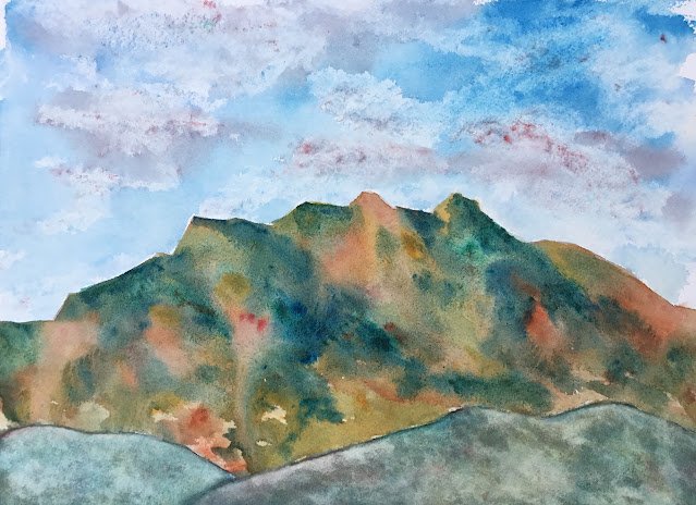
I’m still on the watercolours today but not in the mood to work long and hard at a painting. Maybe it’s because The Ashes are on; maybe it’s because I quite fancy doing some reading and making sure I don’t get to my birthday on Sunday in the middle of a novel with a load of new books there to tempt me. Whatever the reason, I decided that today was a day for an imaginary landscape.
Colour-wise, there were some colours that needed an outing for various reasons. I still have tubes of light red and cobalt blue in my tub despite neither of them being part of my first choice palette. I had tubes of Winsor red and burnt sienna that were almost empty and just begging to be finished and thrown away. And Winsor blue green shade, raw sienna and viridian were all feeling a bit underused. So I went for all seven of those colours, along with titanium white for some texture. With a cool and a middle blue, three warm reds, a cool yellow and a green, this painting is in the key of green warm.
I worked from top to bottom with no particular plan in mind. First up was the sky with cobalt blue on the left and Winsor blue green shade on the right. I greyed things out in places with Winsor red and then dabbed paint off above the grey bit to create clouds. The mountains started off pretty randomly with all seven colours. In a second layer I sharpened all the edges against the sky. Then I added a thin glaze of raw sienna all over it to unify it and dropped in other colours wet into wet wherever I thought the painting needed it. It was probably at this stage that I started making the mountains more shaowwy on the right facing sides.
The foreground hills have a lot more layers of paint. The greys that come from mixing blues with raw sienna had a big role to play here, but I also dropped the green and the reds in in places. At one point the two hills had very different colours and one of the reasons I put on so many layers was because I needed them to harmonise more with each other. I also painted on and dabbed off some watery titanium white to create some texture there. And that was me done.
And this isn’t too bad. The sky is good. It feels like my first blue sky in a while and those two blues worked out well. The mountains are banging, with an amazing shade of orange, a lot of granulation and some great orange/green clashes. And I like the foreground hills, with their texture and colours. But do the three planes go together though? I think the sky goes well with the mountains but that the foreground hills seem to belong in a different painting. Or am I being too harsh?
Whatever this painting’s merits in my own eyes, it’s going up for sale. To see the price, click here.

Leave a Reply