


Back in action today with a soft pastel landscape. I understand that there's a view…
Like A Rolling River
I’m taking a break from portraits for a while (which could be anything between a week and a couple of months) to concentrate on landscapes. And not just soft pastel landscapes: I need to keep up my watercolour practice too.
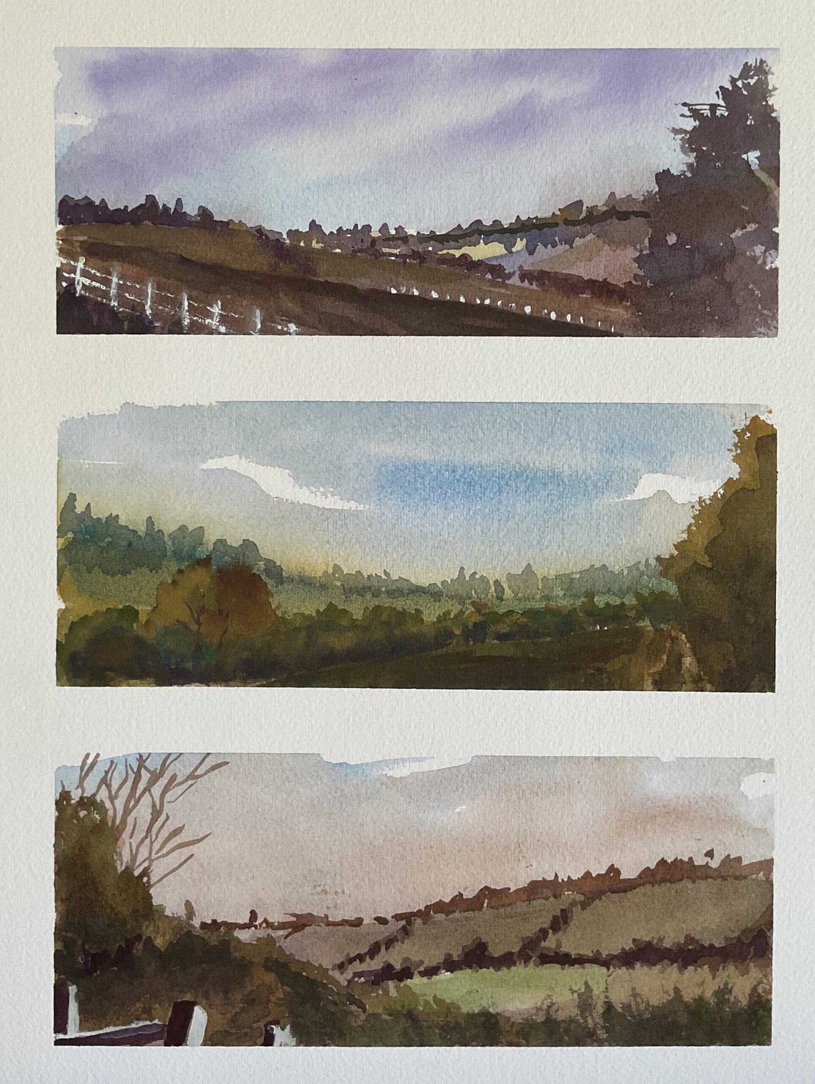
The inspiration for this came from this Steve Mitchell video on YouTube where Steve creates a great triple painting in a loose style and working gradually from dark to light. It sounds simple (which it is, to be fair) but it’s a great exercise for getting back into watercolour landscapes and gives great results. Looking at now well the unsaturated, neutral colours worked out in Steve’s painting, this was always going to be a job for the M Graham landscape watercolours. Remember I have just five colours: cerulean blue, sap green, yellow ochre, burnt umber and doixazine violet.
The only way I consciously deviated from Steve’s exercise was to pick out three views from Queendown Warren to paint rather than just making it up as I went along. I had to crop my source photos into long rectangles and found that these proportions suited the Warren better than the normal 3×4 rectangles. They seemed to give a better sense of space.
Anyway, I divided the paper up with making tape and then got to work. I didn’t put down pencil outlines but went straight on with the paint. I started with the skies, using three different combinations. All three have the blue in them but from top to bottom the second colour is the violet, the yellow and the brown. In all three cases, I went straight in with the paint without wetting the paper first. After that I added two or three more layers of paint, gradually getting darker and biasing colours towards the second colour in the sky, to get subpaintings with a strong sense of purple, yellow (and green) and brown. I introduced a bit of white gouache for fence posts in two of the subpintings. They look OK in the third landscape but not the first, where I’d have been better off with dark fence posts against a lighter colour behind them. Anyway, that was me done.
It’s a decent effort. The skies in all three are amazing and they’re what the eye is immediately drawn to. As for everything else, the third subpainting is my favourite; I think the other two suffer from having too many dark shapes without lighter shapes for them to contrast against. And I’ll let you in on a secret. The first subpainting has deviated from reality: that tree on the right shouldn’t be there and the background hill on the right should be covered in woodland. I got my first and second source photos mixed up. But this definitely catches the feel of the Warren, so is up for sale with the price to be found here. The painting gets its name from the lyrics to Telegraph Road by Dire Straits. I hope to eventually use up the whole track with painting names.
<This is one of a number of local paintings that have been lent to the Rose & Crown in Hartlip to display on their walls. It remains up for sale whether via me or via the R&C. There’s no price difference.>


Leave a Reply