


Here's a question for you. Who had a UK number one in the 1979s with…
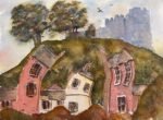
Lewes Castle In Blue And Orange
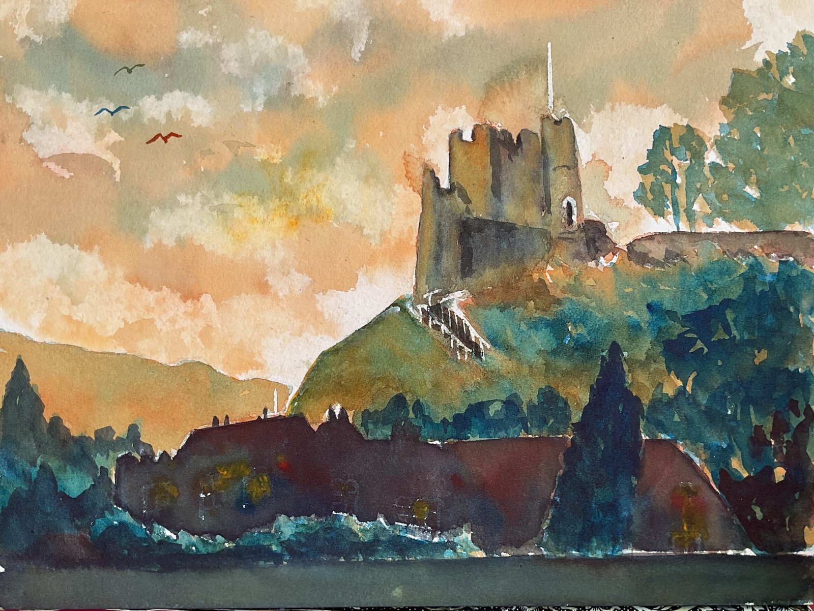
I didn’t waste any time sitting around thinking about doing a blue and orange painting and went straight into action this morning with another painting of Lewes Castle. I’ve used Winsor blue (green shade), Winsor red, Indian yellow and a bit of titanium white at the end, so this is in the key of orange cool.
I started off by putting down a pencil drawing, all in freehand without using a grid and reserving some whites with masking fluid. I included a background hill on the left that doesn’t exist in real life but that I thought was necessary to balance the composition. In retrospect I think I should have left out the foreground buildings as I was in a permanent state of confusion about whether to paint them accurately or loosely.
I mixed up two bigger puddles of blue and of orange and then set about filling the paper with colour, working from the top of the paper to the bottom, or from the background forwards. I didn’t have a value plan in mind but had the vague plan of making the sky more orange, the trees more blue and the building a something in between.
The hill on the left shows the effect that I wanted to see all over the painting, an in between colour in which the orange and blue both shine through separately. I guess the sky and the trees at the top also came out as planned and the castle quite close to what was planned. The rest not so much.
I had loads of trouble with the buildings in the foreground. Maybe I was trying too hard to replicate the values and some of the colours that I could see and not concentrating hard enough on shapes and draftsmanship. They just looked horrible, as if they didn’t belong in the painting. I tried a uniform glaze to bring everything together: orange over everything that was supposed to be green and blue over all the buildings, including the castle. The didn’t work. The titanium white trick over the buildings? That didn’t work. So I went nuclear, mixing up a very dark colour from the blue and red and turning the buildings at the bottom into silhouettes, taking the chance at the same time to correct their shapes. I charged in some of the red, blue and yellow in places to make them interesting and to give the impression of lights being on behind curtains. I also darkened a lot of the trees around those buildings to unify things.
In the castle itself, I added a few shadows using the same colour that I’d used to silhouette the foreground buildings, taking a few attempts to get it right. And as a finishing touch (and to distract the viewer from the foreground) I put three birds in the sky in green, blue and orange, reflecting the colours in the rest of the painting. And that was me done.
The final result is pretty poor. It’s all dark, muddy and miserable rather than the bright, airy painting that I’d intended (and that comes through in the sky and the hill on the left). I don’t even think cropping can save this one. It’s a reject.
Leave a Reply