


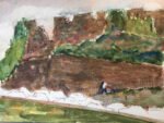
With the whole day available for painting today, I've finally completed a watercolour in the…

Lewes Castle
Here’s a question for you. Who had a UK number one in the 1979s with D.I.V.O.R.C.E.? Good guess but you’re wrong. It was Billy Connolly with a spoof version of the Tammy Wynette original.
But why am I telling you this? Well, at the start of the song the Big Yin says that after he first heard the original version on the radio he couldn’t keep his hands off it. And I know exactly how he felt because I saw a photo of Lewes Castle on top of a hill with a row of colourful houses underneath it looking like flowers. And I just had to paint it but with the houses growing. It helped that I lived in Lewes for about five years in my early to mid 20s.
I picked out Indian yellow, quinacridone magenta and French ultramarine as my three colours, putting this one in the key of purple warm. The blue and the red are great for white buildings and I opted for a warm yellow to go with them because I wanted the painting to have a warm feeling to it. Titanium white was also used later on.
After putting down a pencil drawing red the whites for the window frames in the houses and a couple of windows in the castle via wax resist by drawing them in with a candle. I thought this would give a ghostlier feeling than reserving whites using masking fluid.
I started the sky, extending it to an underpainting over the whole page, looking to kick things off with a bit of warmth. I even put a bit of paint over the white houses: just enough to make them look whiter than white in the sun. After that it was a case of adding layers everywhere and building up the painting. Rather than detailing everything in chronological order (which I don’t have the memory to do) I’ll talk it through element by element.
So, the castle. This started off as a thin layer of the blue and I dropped a little of the red and yellow into it. In that blue layer, I worked reasonably quickly so that I left the odd empty spot that added a bit of sparkle – something that I keep seeing <redacted> doing on his YouTube channel. Much later I added some detail in a darker layer of blue but dabbed most of this off to keep things looking ghostly.
Oh, and some advice for any YouTube artists out there. If you’re going to start deleting my comments on your posts (maybe because they refer to this website, even without providing a link) then I’m not going to plug your YouTube channel here.
The leaves on the tree were stabbed in using all three primaries, quite dry and using a Terry Harrison foliage brush. I didn’t put on any paint for the tree trunks and branches, instead creating them by running a wet brush through the pint marker that I’d already put down on the paper. That worked. The trees, though, were a bit too colourful and hard edged for my liking and I tried to tone them down later, first by wetting and dabbing and later by the titanium white truck, applying a layer of a watery titanium white and dabbing it off with kitchen paper. Things improved slightly but I think I’d have been better off painting the trees in just blue.
All the greenery uses all three primaries. I tried to make things interesting in Shirley Trevena style by deliberately inviting cauliflowers by dropping in wet paint at the wrong moment and by adding granulation medium in places, I so added some salt. Things ended up looking interesting at the top of the hill but not so much further down. And my row of the trees along the very bottom is a bit too regular/periodic.
For the houses, not much to say. I mixed up some paint and coloured them in. At the very end, I applied the titanium white trick to them and this improved things slightly.
I finished thinks off with some brick and tile work and three birds. And I improved the trees slightly by adding some sky holes in titanium white and dabbing the white off. And that was me done.
And I like where this one ended up. I was expecting the houses to remind me of the moving arrows in the opening credits to Dads Army but they’re reminding me more of The Scream by Munch. The sky, birds and castle are top drawer and I’ll be trying to repeat this success sometime soon. The washed out castle does, though, clash with the heavier paint in the hill below it. I’m not sure whether this is a positive or a negative but it’s definitely interesting. It’s as if the castle is visiting from another universe. Until you realise that with those weird houses, the castle’s probably from our universe and visiting someone else’s.
This one was quickly bought up by a previous customer.
Leave a Reply