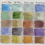
I had just the right amount of time to spare today to do some swatching,…

Les Dawson
After almost a week off, I’m back to painting today. After seeing how the M Graham landscape colours resulting quite restrained, grown up landscapes compared to my usual standards, I quite fancied having a go at a portrait with them. I don’t see how these colours could work for a posterised painting, so instead, I avoided that easy route and went back to painting properly instead. As a subject, I went for the late Les Dawson after seeing him in a YouTube video over breakfast today. He is a portrait artist’s dream, it has to be said.
I’d love to be able to stand here and say that I’d not used the Notanizer app but I did. I only used it, though, to get down all those darks. The rest of the painting was down to observation. I started by putting in the darks with a mixture of the green and the purple. As I always say when painting this way, those dark areas give me something off which to hang the rest of the painting. I did go back later and add another dark layer on top. After that, I added a middle tone layer over most of the face, using all five colours and letting all of them shine through by graduating the mix all over the face.
Everything else was painted pretty loosely, with the exception of some of the creases and shadows on the shirt, which first appeared in that initial dark layer. For the shirt itself, I put on some watery purple and dabbed it off, later doing the same thing but with the blue. The background was painted in really loosely, so as not to distract from the face. I used all five colours to put the various features in the background, then painted the wall in a light, watery, blue-grey mixture. Because the wall was looking a bit boring, I dropped in all five colours wet into wet in various places, then quickly dabbed them off with kitchen paper. It looks OK, even if the purple in there is a bit too dominant.
As a final step, I stood back from the painting to check the likeness. I added some more facial creases in my dark mixture and then mixed a medium/dark brownish colour to darken a few places where I felt I needed tones somewhere between my mediums and darks. And that was me done.
And what an interesting experiment that was. These M Graham landscape colours also work for portraits. The colours in that face are worth the entry price on their own. Likeness-wise, this is unmistakably Les, even if there’s a little bit of Richard Whiteley and Harry H. Corbett in there too. Compositionally, there’s a nagging voice in my head telling me that the darks in Les’ face and hair might be too dark and that they unbalance the painting. This is something for me to watch out for in future but today I count this one as a success and it’s up for sale.


Leave a Reply