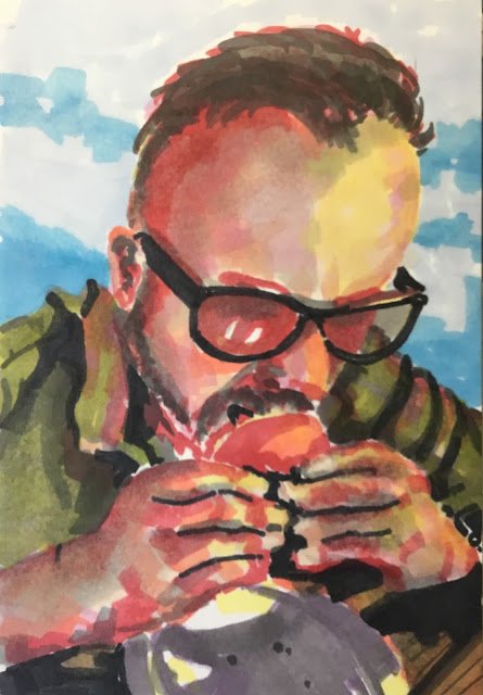
Time for another set of marker portraits. I've done chess, physics and westerns, so it's…

Lee Davey, The MacMaster
Now then my friends, I am in the Kent village of Hartlip and I’m here to show you the fifth in my collection of marker portraits if YouTube creators. This is Lee Davey who, as The MacMaster has a YouTube channel where he reviews food joints in the U.K. and, occasionally the US or Benidorm. Another food channel worth mentioning is Danny Malin’s Rate My Takeaway, which is the sort of positive and entertaining experience that you need sometimes. Lee’s channel is the one I prefer out of the two: I just find him a bit more discerning when it comes to both his choice of outlets and the marks that he awards out of ten.
So I have a Lee Davey portrait here. Before we go any further, take a closer look my friends.
The plan today was to make this another fairly monotone painting with black, red and pink as the main colours. Maybe orange or yellow at a push. I started with the black marker, putting in all the darkest shapes. That went pretty well. And I decided to use the purple marker to put in the shadow on the plate. Controversial! Does purple belong in an analogous red palette? Let me know in the comments section below.
But then I went on to the reds and pinks and things started to fall apart. It was the reds and pinks just don’t work on their own and I found I needed to bring in more colours. So I added some yellows and oranges in the lightest places. And used some greys to neutralise some of the more garish reds and pinks. And I glazed over all the skin areas with a couple of different flesh tones. But I wanted this to be more about the reds and pinks, so I also put in some complementary colours: the blue in the sky and the green in the t-shirt.
It all ended up a lot more colourful than the red and pink portrait that I’d planned and I may need to rethink the colour scheme for the final portrait in the collection. Maybe that last one could just be in red, no other colours. I’ll have to think about that.
As for this one, the likeness isn’t really there and the hands are an eyesore. Sorry Lee. This one’s comfortably worst of the collection so far and won’t be going in the shop window. And while it’s not great in its own I think it fits in well with the rest of the collection and adds to the synergy.
And that’s me done. I’ll see you guys in the next one. Goodbye.


Leave a Reply