


The day's not over and I have gone for one more painting! While my mind…
Krys
Still not feeling the watercolours so today’s an Artgraf day. It’s also a day of experimentation because I’ve bought a hot pressed watercolour block to use with the Artgrafs. I’ve found that on cold pressed paper the Artgrafs granulate too much for my liking, leaving things looking quite spotty. So I thought I’d try them out in the smoothest watercolour paper there is. I’ve used hot pressed paper before, for dash & splash paintings but the 100% cotton Arches Aquarelle paper feels like a huge step up in quality compared to the paper I was using for those.
Today’s model is Krys, making her debut on this blog.
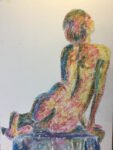
I used a block to put down a pencil outline to get me started. Then I put down loads of colour. Yeah, this paper was feeling really good. This is what the painting looked like before adding water:

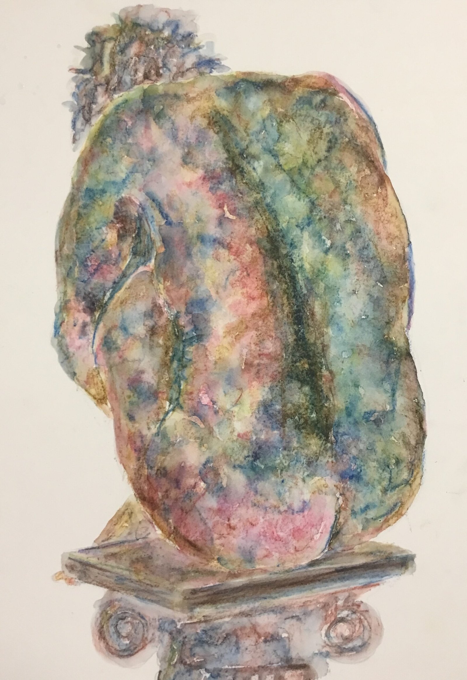
And you can see that I’d already screwed up at this stage. I was just jamming away, getting into the music and enjoying myself without noticing that the photo I was working from was a different one to the one that I’d used for the pencil outline. I mean, just look at that blue line that’s presumably a backbone.
So, this obviously isn’t going to end up as a painting good enough to go in the shop window but let’s carry on. I added the water next, dotting in little bits of water and washing my brush between each dot. Once again, the paper felt great, being smooth enough to let the blobs run together. I even ended up with cauliflowers in places, which is nothing short of amazing for what’s actually (I believe) a graphite-based medium. Here’s what I ended up with:

Yeah, that backbone is ugly but this was a day for experimentation and I’ve discovered that this paper was made for the Artfrafs. Everything just works. I usually cause myself problems by putting on too much colour and thought I’d done that today but this paper even manages to solve that problem, even allowing the excessive colours to shine.
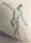
After letting the painting dry, I tried drawing in more colour to move the backbone, plus a bit more colour in places (in particular what I thought was a tiny hint of blue on the left). The final version is at the top of this post. The backbone still looks wrong and I was overzealous with the blues so this isn’t going in the shop window. But the experiment was a success and, going forward, the Artgrafs will be much easier to use.
Leave a Reply