


After two days out on the road with the watercolours, today's weather forecast was…
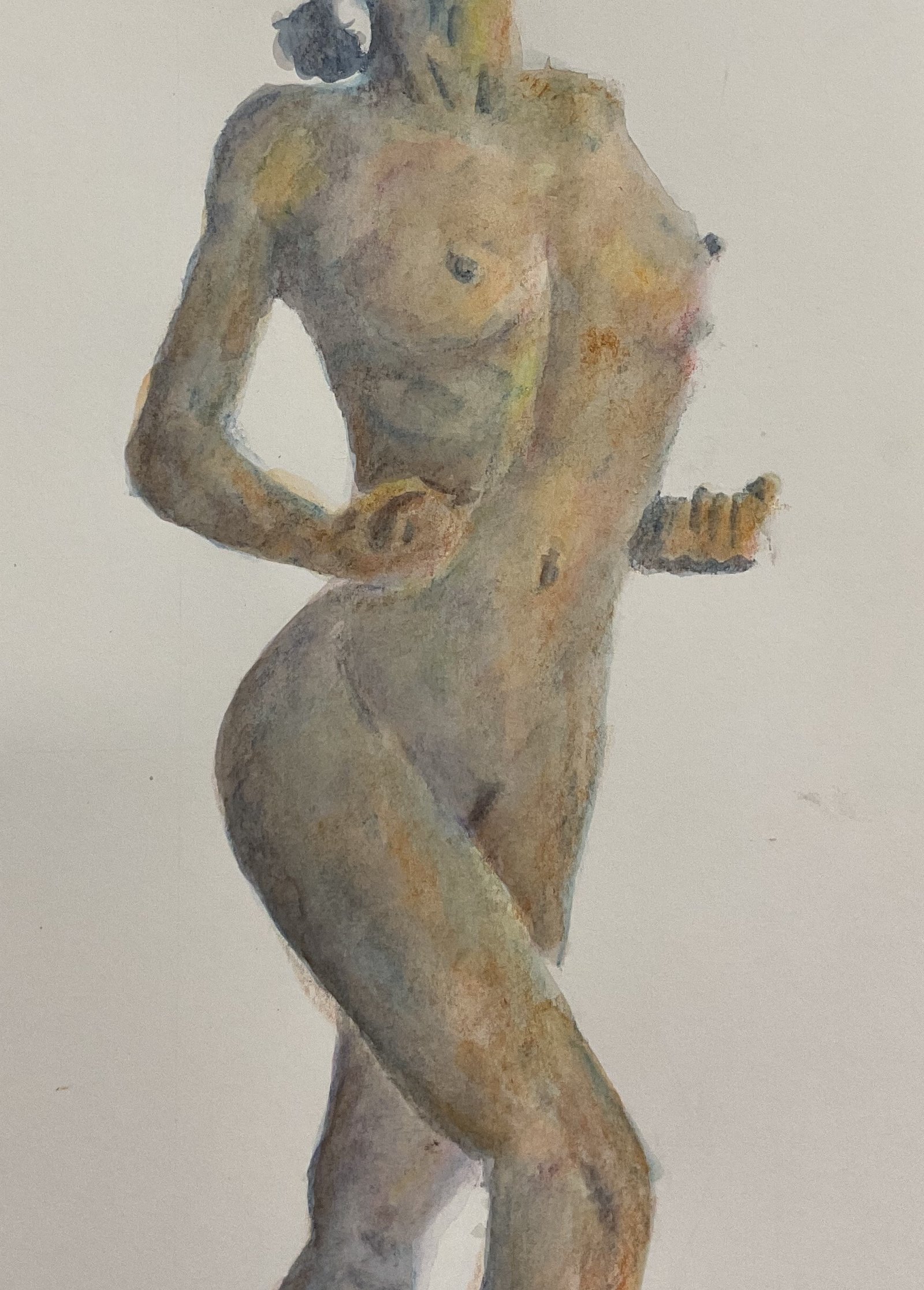
Kristy Jo II
I wasn’t in the mood for hard work today, probably because I’m only 40 pages away from the end of a 1300+ page long Murakami novel and feeling distracted. So I thought I’d do another Inktense figure painting. Today’s model is Kristy Jo, making her second appearance. I picked out this particular pose because I thought the fists might look good if I only painted in the very darkest areas.
I thought I’d be disciplined today, though, drawing the figure by hand, via Anthony Ryder style envelopes and identifying values by eye rather than using an app. But I struggled with the drawing and eventually gave up my feeble attempts and went for a grid instead. I did, though, manage to stay away from the Notanizer app, which was a positive.
Colour-wise, I started with indigo in the darkest areas and sea blue in the adjacent mid tones. But I st adding some paprika and sherbert lemon on some of the right-facing shapes. After wetting the marks, I realised that indigo, being so much darker than other colours, was better suited to working in its own. Alongside sea blue, the indigo was too dark. And it was at this point that I decided this wasn’t going to be a minimalist figure painting like my last one in inktense pencils, but one where I was going to experiment with multiple layers.
I started by adding bark over the darks and leaf green, iris blue and more of the red and yellow over everything else. The results were interesting but I wanted to push further.
So I added violet over the shadows, fuchsia over the mid tones, Persian red over the light areas and Sun yellow over the highlights.I got another interesting set of results. The shadows were starting to look particularly interesting, like those in a really good watercolour.
The figure was looking a bit green at this stage, so I put a layer of Persian red over everything except the highlights where I added orange sorbet. An improvement but things were starting to look too orange, so I added a layer of iris blue over everything except the highlights. And some more Persian red over the fists, which had been looking a bit yellow.
I finished by adding a layer of baked Earth over everything, a colour that I thought might drag all these impressionistic colours slightly back towards flesh tones. Rubbed out any pencil lines that were showing and that was me done.
The result is a success in that the colours here are amazing and have given me ideas for future paintings. Just imagine what this one would look like in inktense pencils with those Artgraf colours replaces by multiple layers of inktense pencil. That would be amazing. But this one, though, isn’t going up for sale: the two fists don’t work for me.
Leave a Reply