


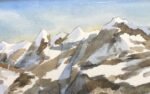
21 May 2018 After the success with mountains a couple of days before (Susten Pass)…
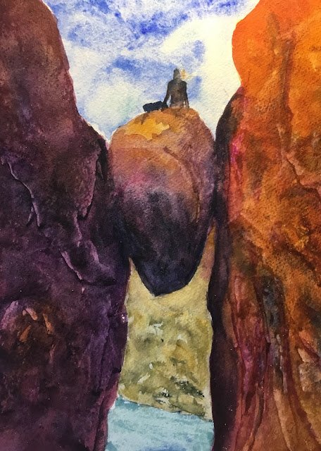
Kjeragbolten
Yesterday’s paintings were bad. To help me find some form, I thought I’d look for some precarious rocks. I managed to find Kjeragbolten, which is a rock wedged in a crevasse (technical term) in a mountain in Norway. I understand it’s a lot easier to get to than it looks and that it’s a not to be missed photo opportunity for all tourists in the area,
The main three colours today were French ultramarine, quinacridone magenta and Indian yellow, one of my favourite combinations, in the key of purple warm. The only other colour in there is viridian, brought in mainly for the water but also mixing with the magenta to something close to black, which was handy in the darkest shadows.
The three background shapes went down first. First was the sky with the blue and a little green. I suspect I’m not quite getting the Bridget Woods technique right as I keep finding myself blotting colour out with a kitchen towel. Maybe I should just let it dry and see whether it ends up as dark as I was fearing. Then there was the land using the three primaries and the sea using the blue and green. Both were blotted dry, although the sea I rolled it dry rather than dabbing and ended up with something approaching waves.
Then it was the rocks. I did the three shapes one at a time rather than risking paint drying too quickly. In all three cases, I wet the area first, then added a neutral mix and then all three primaries were dabbed in to liven up the neutral colour. After that, there was a lot of tinkering. I think I started with shadows and cracks using a mix of the blue and magenta. I used a lighter version of this mix for lighter shadows. The shadows included a gull purple glaze all over the shape on the left, which I added textures to using the side and corner of a credit card. I darkened the darkest shadows using the black that I mixed from green and magenta. The shape on the right wasn’t looking great, with the cracks that I’d painted on standing out too much against what was behind, so. I took a big risk and glazed it all over with a orange mixed form the yellow and magenta, then added some shadow colour and scraped at the shadow with a credit card. This seemed to do the trick. I think I fiddled some more with shadows at the end. And I tried getting texture using salt at various times. There was a lot of fiddling with those rocks.
At the end, I thought two finishing touches were required. One was to put some greens and blues in the land shape, which had been looking too flat and monotone. The other was go add a figure to give some idea of scale. After a lot of practice on crap paper with Frank Clarke “carrot people”, I decided to just have someone sitting down and looking away from us.
And I like this one. It’s not my best ever but I like it. The middle rock looks firmly wedged in there thanks to the black occlusion shadows. That middle rock is also definitely three dimensional. I was expecting this to look muddy but there are some are interesting colours in there, especially the orange at the top of the shape on the right. And, of course, paintings with lots of orange and purple in them do tend end to sing, not that this was planned today. The worst thing about this one may just be the figure but the painting still wouldn’t be as good without him.
This one’s up for sale. To see the price, click here.

Leave a Reply