


So here’s the thing. I need to put my Landscape Artist Of The Year entry…
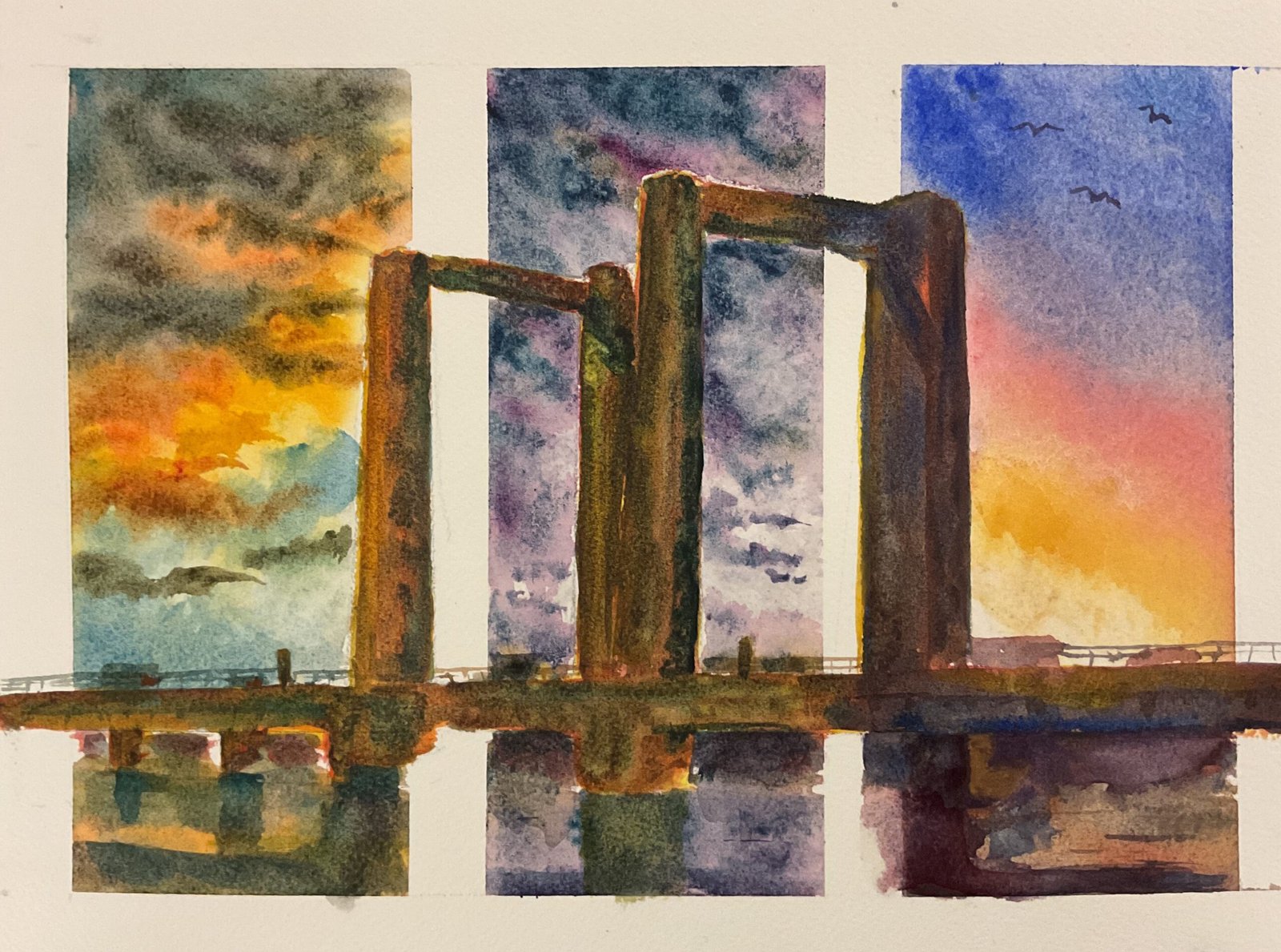
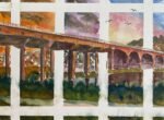
Kingsferry Bridge Under Three Different Skies
It’s a watercolour landscape day today. I’ve been saving up some photos with amazing looking skies that have been posted on Facebook by a couple of friends and was finally in the mood today to turn them into a painting.
For a random subject to put in front of the sky, I decided to go for Kingsferry Bridge which connects the Isle of Sheppey to the rest of Kent. For years it was the only connection but now there’s a huge multi lane dual carriageway bridge next to it. This older bridge appears in an episode of Some Mothers Do ‘Ave ‘Em and the bit between the towers can be lifted up to let tall boats through.
Compositionally, my original plan was to come up with four separate landscape format paintings showing the bridge from four different angles, something I did years ago with The Angel Of The North. But on today’s four mile walk I decided instead to go for one view divided up into panels with different skies in each. I considered dividing the paper into quarters with an X and having one sky on the left, one on the right and a third at the top and bottom. And I considered dividing a page (in landscape or portrait format) into three or four vertical panels. In the end I settled for landscape format and three vertical panels.
I had to do a lot of planning before getting started, having to pick three skies and the colours to use in them. I wanted to go for simple red/yellow/blue palettes, with different colours in each panel if possible. With three transparent or semi–transparent yellows, three reds and four blues to choose from, I looked for and found a way to use all of them, meaning thatching of the panels has two blues in it. So the plan was:
– On the left, a sky based on a photo taken by Howard Moore in Petworth in the USA. Rose dore and Indian yellow would give me those yellows and oranges in the sky and a cool blue would work for the blue sky and to turn the other colours to a good grey for the clouds. I used both cerulean blue and Winsor blue green shade in this one. Which means this panel is in the key of orange cool.
In the middle is a sky based on a photo taken by Cathy Stone in Buckinghamshire, one she described as not the most friendly she’d ever seen. Quinacridone magenta and Mayan blue genuine would give the range of purples I needed, with the Mayan blue also containing ground up stones that might make the sky look even rougher and less friendly. There’s no yellow in the sky but transparent yellow makes decent enough neutrals with that red and blue. So this panel is in the key of green cool.
And on the right is another of Cathy’s Buckinghamshire skies. I’ve used French ultramarine, Winsor red and raw sienna, so this is in the key of triadic right. It gave me the reds and oranges I needed but not the best purple. It works for me though.
For the painting itself I started by putting down making tape, not just to separate the panels but also to leave white borders round them that will still be visible when the painting’s framed. Once the tape was down I gridded up and drew on the outline of the bridge. I’d planned ahead to make sure everything would look OK and that I didn’t for example, have the edge of a tower lining up with the edge of the tape.
After everything was prepared, I painted in the skies and water reflections. I didn’t use masking fluid to reserve the bridge shapes – if paint spilled over into then, I just lifted as much of it off as I could with kitchen paper. The third sky was the one I had most trouble with, having to work hard with granulation medium, ox gall liquid and a water spray to get the red to mix with the blue and the yellow. It looked never looked right and I eventually gave up, only to find that it looked great once I’d allowed it to dry.
Then it was time to paint the bridge. I decided I didn’t want the bridge to be constrained by panels so I removed all the making tape first, then drew in all the bridge shapes that had been masked out. I painted the bridge in three layers: yellow, then red, then blue. But this wasn’t a three layer glaze job. I kept adding layers while the paint underneath was still wet. With so few of these colours being stainers, the idea of glazing didn’t make much sense to me. I tried to blend one colour scheme into the next in the white bits between panels. In places where I was using the same colouring overlapping shapes I would paint each shape separately to draw out the difference between them. Somehow the application of three fairly uniform layers of colour managed to create quite a variegated colour in all three panels.
Finally, there was some tinkering. I added some really dark colours to the bridge in places to create a shadowy effect. I corrected some of the wobbly straight lines down the edge of the towers by adding straight brush strokes, often in yellow down the left and blue down the right. I added some traffic to the bridge, smaller than it should be to make the bridge look bigger and put in the fence barrier. I tinkered with some of the shadows and reflections in the water. And finally I added some birds in the top right. And that was me done.
This came out much better than I thought it was going to at one point. The colours in the skies are great, not because they’re realistic or anything like that but just because they’re pleasing to the eye. There’s also an interesting arch effect with the clouds on the left and the colour bands on the right pointing up towards to the top of the towers. The weakest bit of the painting is below the bridge but the arch effect and the low viewpoint (with the towers getting narrower nearer the top) both drag the viewers’ eyes upwards. And the panel effect works. I like this one.
It was sold in double quick time to a local dentist who’s going to put it up on the wall of his practice on The Island. And I’ve just seen where he lives. He lives in my official hotspot. His neighbours in the left have one of my paintings in their wall. His neighbours on the right have one of my paintings on their wall. The woman opposite has one of my paintings on the wall. And (get this) the people he bought the house off also have one of my paintings on their wall. Of the house itself.
Leave a Reply