


Two paintings in one day! It's as if the hardest bit about painting is the…
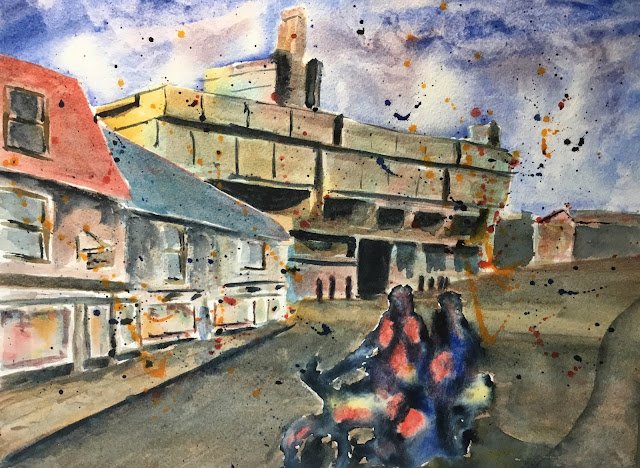
King Street, Cambridge
So here’s today’s second painting. I’m prepared to put the first one down as a warmup but this one needs to be better. It’s another view of New Court, Christ’s College but this time it’s from the back. To be fair to the College, the back of New Court has been redeveloped since my source photo was taken and now fits in properly with the rest of King Street rather than looking like a builders arse hanging of his jeans. This was how it looked in my day though.
The main three colours were rose dore, cerulean blue and raw sienna. These three colours were used throughout the painting, which is therefore in the key of green warm. French ultramarine, Indian yellow and Payne’s grey will all be making appearances later.
Just like last time, it was a Bridget Woods sky first (again with French ultramarine rather than cerulean blue), then some Ian Fennelly buildings. I tried to make the roofs on the left more colourful to contrast against New Court. I also darkened their values for the same reason. I mixed up various neutral tones form the three primaries and used these to add in details like shadows, doors, windows and a hanging sign. I went over all these darks several times. I also added some pure primaries in places in the shop windows for some colour.
I decided that the motor cyclists would be abstract silhouettes, so masked them out before painting in the toad and pavement. After removing the masking fluid, I wanted bright colours in the silhouette, so wet it all first, then added a few blobs of rose dore, French ultramarine and Indian yellow. After this, I added Payne’s grey in the empty spaces and the water on the paper did all the work for me, although I tried to put yellow on highlights and faces and make the grey darker where I wanted to suggest arms and legs.
At his point, though, the silhouette was contrasting too much against the background, so I went over all the shadows with Payne’s grey to bring everything together. I even applied a thin glaze of Payne’s grey over the shadows in the road.
Even then, the motorbike was looking a bit too static, so my last step was to do some spattering. I used the colours in the silhouette: Indian yellow, French ultramarine, rose dore and Payne’s grey. I may have been a bit heavy with the spattering but I think the painting needed it.
It’s not been a great day for me as I’m calling this one another flop. There may be some perspective problems there: the line along the bottom of the roofs is diverging away from the New Court line that has the biggest shadows below it. These two lines should all be converging as we move from left to right. The silhouette doesn’t work: the red, blue and grey have made no effort to blend together, so it looks all spotty like Mr Blobby. And the spattering’s definitely heavy, even if the painting would look worse without it.
Again, I’m going to put a cropped version on Facebook, Instagram and DeviantArt. Lose a lot of unnecessary stuff on the right.


Leave a Reply