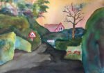
Lots of old keys laying around the house after getting all the doors and windows…

Key Street, Florida
First things first. This painting was inspired by a photo by Harvey Jones that I saw on the BBC website. He has a Flickr account at https://www.flickr.com/photos/148416622@N07/ and a website at harveyjonesphotographs.com. Talented photographer.
Ok, what did I want to do today? Well, I’m almost through my second read of Making Colour Sing by Jeanne Dobie (review coming soon) and wanted to try out a couple of her ideas. The first was atmospheric glazes. You put down an all over yellow glaze, let it dry, do the same with red, let it dry, do the same with blue, let it dry. And you end up with amazing colours that you can only get this way and would never get by mixing colours in the palette or on the page.
The colours all need to be transparent, non-staining and ideally based on a single pigment for atmospheric glazing to work. This pretty well restricted me to a purple warm key: Indian yellow, quinacridone magenta and French ultramarine. Maybe I need to replace rose dore with (non staining) quinacridone red as my warm red if this becomes a regular thing. So I laid down the three glazing coats after protecting the figure, plank, etc with masking fluid.
The second tip I took from Jeanne was to mix my own greys from the three primaries, so I’ve only used three colours in the whole painting. The idea was to use complimentary greys: a yellowish grey against the purple and a blueish one against the orange.
How did it all work out then? Well, the glazing was a big success. My technique was different to Jeanne’s. She mixes loads of paint in a paper cup so she can load up a brush and not keep refilling it. And she glazes over with clinical accuracy, like someone cutting the lawn in Wembley stadium. I didn’t use a paper cup, so had to keep refilling my brush. And I found myself repeatedly brushing from left to right and right t left, like I was painting a wall. I also didn’t worry about missing the odd spot due to the texture of the paper, whereas Jeanne insists on covering every spot. But the result was fantastic. I’ve graduated it a bit, with more yellow at the top and more blue at the bottom. You can’t see where the horizon is, but honestly who cares?
The colours in the silhouette were less successful. I struggled to get the vibrant greys that I wanted. I’ve ended with a brown at the bottom, a plain grey at the top and a bit too abrupt a transition between the two.
But I’m pleased with the result. The background really does sing and make this one a keeper. It’s up for sale. To see the price, click here.


Leave a Reply