29 June 2018 And now a genuine abstract. What can I say about this one?…

Jupiter And Io
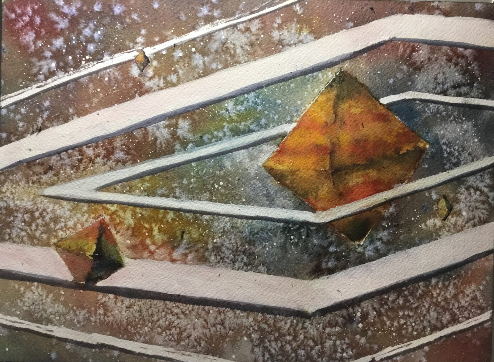
Seventeen days since my last watercolour and I’m finally back. The idea for this one popped into my head while out on my walk yesterday. I’ve no idea why I was thinking about painting planets at the same time as I was thinking about the five platonic polyhedra but I was and somehow I ended up mashing the two together. This will end up as the first in a series of planet paintings but I’m not sure yet whether it will be five planets shaped like the platonic polyhedra or paintings of all eight planets but with various different creative twists.
I started with French ultramarine, transparent yellow and Winsor red as my three primaries, liking the different mixtures of these I could see in my swatches and thinking that they looked right for Jupiter and its moons. But cadmium yellow was introduced later, so with both a cool and a warm yellow playing important roles, this isn’t in any particular key. Titanium white was also used later along, along with, for the first time, white gouache. Titanium white still has an important to play in the “titanium white trick” that adds texture on top of artificial looking washes. But gouache is more opaque, so will give better spatters and highlights that might only need one layer of colour.
To kick off, I put down pencil outlines and them masked out the rings. We all know Jupiter has rings, don’t we? It’s not just Saturn. Where have you been for the last fifty years? Anyway, yeah, I used a ruler to put down all those starting shapes. I was especially careful measuring out the two biggest octahedra, basing these on a couple of photos I found on the internet. When I got to the rings, though, I got lazy and just guessed where to put them. Any draftsman will tell you that the corners of those square rings need to lie on imaginary lines that pass through through two of Jupiter’s vertices, which they don’t. My lazy approach has left me with rings that are slightly out of kilter everywhere. Once the outlines were down, I masked out the rings, added spatters all over and removed any that landed on the planet or any of its moons. To keep things interesting, I made the outermost ring more patchy than the two more solid looking inner rings.
Oh, while I remember, the size, positioning and orientation of the three moons in the painting were all carefully chosen using compositional considerations. I just wanted something that looked balanced. The nearer moon, though, is Io, which has interesting colours. I’m not going to name the other two.
I started by painting in the starry background. I mixed all three starting primaries into a neutral colour and put this down while varying the mix everywhere. I was especially careful to make the background bluer around Jupiter to complement the oranges there. I might have even put on the odd bit of neat red, blue or yellow in places to increase the degree of variegation. I dabbed out a little bit of paint in places with kitchen paper to create some cloudy atmospherics. And then I threw on some salt to see what would happen. And for once I timed the salt perfectly, too perfectly in fact. Every grain I threw on must have spirited wings – I May have ended up with more salt texture there than was really needed.
Once the background was down I moved onto the planet and moons. My plan was to have light coming from the top left, so that the top left triangle in each octahedron was lightest and the bottom right triangle darkest. I remembered that, next to a sharp edge with light on the other side, the darkest bit of a shadowy face is the bit closest to that edge. I didn’t have too much trouble with the moons, with two or three layers and the titanium white trick being enough to create some interesting objects. Jupiter, though, gave me some problems.
I wanted Jupiter to be instantly recognisable with its stripes and with the red spot in the bottom right face while also trying to make it look three dimensional. I tinkered for ages with layers of locally coloured stripes and layers of neutral colours in varying values to create the 3D effect but just wasn’t happy. The longer I went on, the less the yellows that I added looked yellow. I’ve had this trouble with transparent yellow before. It can be a bit wimpy when laid on top of other colours, being seemingly more interested in letting the colours underneath through than in standing up for itself and screaming yellow. So I pressed the nuclear button (not for the first time) and brought in cadmium yellow for its opacity. I also used a little bit of titanium white in places to create some lighter blooms. I eventually got something I was happy with, even if I’ve ended up with something that’s more orangey than the yellow I was after.
Then I removed the masking fluid. I made a bit of a hash of things, ending up with lots of smudges all over those lovely white rings. So this was a great excuse to try out the white gouache. I went over all the rings with gouache, using a paper mask to get the edges straight. The second ring picked up a pinkish tone from me not cleaning my brush properly. I quite liked this so made the inner ring blueish.
To finish, I added a white highlight alongside top left edge of each of the octahedra and then, to make the rings more solid, added a grey line along all their bottom edges. It gave them then a bit of thickness and they looked better for it. And that was me done.
And this is really not too bad at all. I went into this without a value plan but it looks as if I did have a plan. Jupiter and Io are, if anything darker than the background which is weird but it absolutely works. There are lots of places where dark edges are close to white areas too. The background colours are also great and, even after adding too much salt, the salty texture also works. Even those rings that are slightly out of kilter work: their workings is just jarring enough to impart a bit of energy and interest.
This one keeps growing on me the more I look at it. It’s up for sale. To see the price, click here.


Leave a Reply