Next up in the Led Zep collection is the late John Bonham. He's going to…

John Cleese
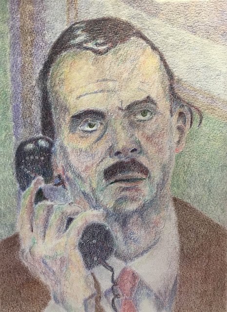
I had a premonition the other day. Maybe it’s all to do with new episodes of Fawlty Towers being created but I’ve convinced myself that John Cleese will be popping up as a guest sitter on Portrait an Artist Of The Year. The judges are currently reviewing all the entries for PAOTY so might come visiting t his site. If they do, I want them to see how I can make a half decent job of John.
After putting down a grid of squares and sketching in some shapes, my first step is to block out some shadows. Both the darkest and the lightest shadows but with either more pressure or a second layer in the very dark set areas. All of this is in monotone with some random dark colour – this time it was mauve. Although this is very similar to the method described in Bill Maughan’s book, it’s a technique I came up with independently. You can probably tell that I’ve not followed Bill’s advice in this painting but that’s because it was about 80% completed before I started reading Bill’s book. My next coloured pencil portrait will have more of Bill’s influence in it and should be interesting.
After that, a case of adding layer after layer of colour, randomly moving around the page rather than concentrating on one shape at a time. The phone, the hair and the jacket are the places where I had most fun, adding so many different colours. I didn’t touch my black or sepia pencils while doing this one. I was enjoying myself too much with all the other colours. At one point the background didn’t all hang together, feeling instead like a set of disparate shapes. Buy two layers of colour (a grey and a light blue) over the whole background solves that problem.
Then we come on to the finishing touches. I tried to do lots of close up work on the eyes because they’re the most important area. This included adding some tiny highlights to the irises and along the tear ducts (thanks Bill) using a putty eraser and some stencils. I also dabbed out those round white highlights on the phone and slightly lightened the background in places where I wanted it to contrast with the dark shape of John’s hair. For the smoothing stage, I started with a colourless burnisher on the eyes, the phone and the most highlighted areas of the face because I wanted these to shine a bit; for the rest of the painting I smoothed things out with a paper stump. In the smoothing I deliberately fuzzed all the edges (sgraffito style, thanks again Bill) everywhere except around the eyes where I wanted more focus. I guess I could and maybe should have had hard edges in any cast shadows too.
“And that was me done.” That’s going to become my catchphrase. It’s not a perfect likeness but good enough to go up for sale. To see the price, click here. It’s unmistakeably John but I can see elements of the bank manager from Mary Poppins in there. The high spots for me are the tie and the back of the hand, although I also like the phone and the cord. And obviously the sgraffito fuzziness is there as usual – it looks as if that’s going to be a part of my style that I can never shake off.


Leave a Reply