


Next up is Private Joe Walker, played by James Beck, one of my favourite two…
Joe Strummer
I’m back from the Upchurch art exhibition now and my studio’s all back to normal. I only sold the one painting, The Happiest Days Of Our Lives but, you know, this is a hobby, not a business. My work attracted lots of interest, and that’s the main thing.
One guy liked my John Lydon portrait and we got chatting. He told me that if I ever painted a portrait of Joe Strummer from The Clash he might be interested in buying it. I said, without committing, that I might give him a go and he took away a business card with my email address and website on it. I had no idea what Joe looked like, what with me being a blues and Southern rock man rather than one of those punk rockers but after looking around the internet, it became clear to me that Joe would make a great portrait subject.
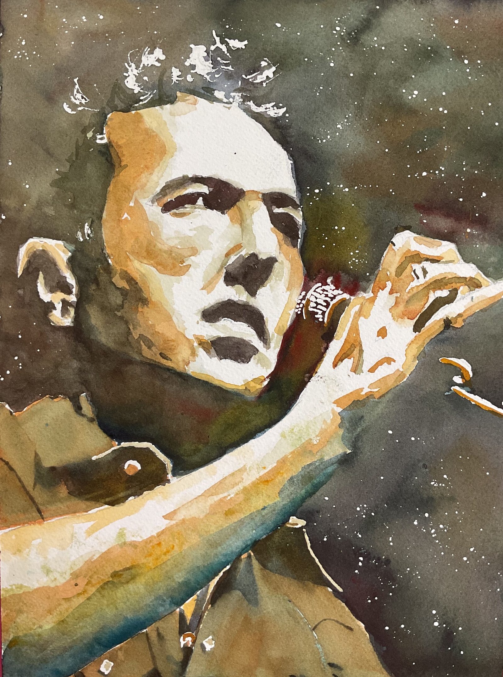
I picked out a source photo that was monotone and almost chiaroscuro in that it was all dark and light tones, with just a few mid tones in the shirt. I decided that I’d do most of this one in a dark neutral colour rather than going for a rainbow portrait, so I picked out Winsor blue (green shade), Winsor red, Indian yellow and burnt sienna, the same colours as I’d used for Sir Bobby Charlton about a month ago. So this is in the key of orange cool.
I put down a pencil outline first, using a grid as usual. Then I masked out some highlights on the face, hair, shirt and microphone, including an important white shape on Joe’s right eye, and spattered on some stars in the background. Then it was on to the fun part.
I mixed up my three primaries into a very dark neutral colour and painted over all the darkest areas. I started with the eyes, nose, ears and mouth to give me something to hang everything else on, then moved on to the background, including hair, neck and the bottom of the arm. While painting in this huge background shape, I tried to variegate the colour, making it look bluer, redder or even greener in places. I found myself going over with a second layer to darken things before the first had even dried. I also added extra layers to the facial features but only after allowing them to dry. After putting down the background, I put in all the darkest bits on Joe’s shirt and between his fingers, a much more relaxing step as the darks were smaller shapes.
Then I moved on to mid tones. I started with a fleshy looking mix of raw sienna, Winsor red and Indian yellow. I put this in various places in the face, hand and arm. I added some water to my mix and added this in places where I wanted a light to mid tone.
Next it was the shirt. I’ve not done many watercolour portraits so far but I know the shirt can make or break things. With a green looking background and some orange looking mid tones, I could have gone for an orange or a green shirt. It would harmonise with one of those two colours and complement the other. I thought I’d try something orangey, the idea being that the orange in the shirt would show up as reflected orange light in the skin. But, no, orange didn’t work. So I mixed up a really thin watery puddle of Winsor blue and glazed this over the top. It got me to this amazing green colour that harmonised with the sky and complemented the orange on the skin but I could see that the orange in the skin was included somewhere in that green on the shirt. The limited palette was working the way that limited palettes should.
For a final bit of tinkering, I mixed a greeny neutral colour and used this to cool down some of the warm orangey midtones in places. At the same time, I made the arm more pronounced by putting another dark layer over its underside but with a very blue bias to it. I think that without this blue, the oranges and greens in the painting might be a bit boring.
And, after leaving things to dry, removing masking fluid and adding a little colour to some of the white shapes revealed, that was me done.
I’m no Clash fan so can’t really tell whether this captures Joe and his likeness but I do know that I captured the person that I saw in the photo. The best thing about this one is Joe’s right eye. That triangle of white in there is ambiguous. Is it to the left of the iris or to the right? When I look at this one from a distance Joe’s looking ahead, over the microphone to our right; when I look at it close up, he’s looking to his right, straight at me. It’s a happy accident but it’s also genius. And someone on LinkedIn just commented that it looks as if there is loads of sweat flying around, which adds to the energy. I’ll take that thanks. If there’s one thing about this one that I’d change, though, it’s that I’d soften some of the edges on the dark and mid-toned shapes. Too late to do anything about that now as the red and blue that I used were both stainers.
So Joe’s definitely good enough to go up for sale. To see the price, click here.
<The guy from the exhibition never got in touch so Joe’s still looking for a new owner>
Leave a Reply