


I had a chance to do some painting today, so thought I'd better take it.…
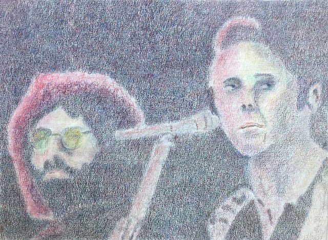
Jerry Garcia And Bob Weir, Copenhagen 1972
With all this coloured pencil jamming I’ve been doing lately, I’ve been playing a lot of Grateful Dead. YouTube has obviously gotten wind of this, so recommended that I take another look at a video I’ve watched countless times of the Dead performing Me And Bobby McGee at Copenhagen on 17 April 1972. It’s a great performance and you can see from Jerry’s celebratory neck twist at 2:48 that he knows he’s absolutely nailed the guitar solo. But for today’s purposes, it’s more important to note the graininess of the video and how Jerry’s and Bob’s tops are dark enough to blend into the background. This video was absolutely begging to inspire a coloured pencil portrait.
So, as is usual for my portraits, I started with a grid, placed all sorts of important points on the paper using a ruler, then drew on some quite faint outlines. And then I was ready to get started.
And I started with the black that covers most of the paper. This has seven layers to it. In order, they were delft blue, dark pthalo green, dark red, helio blue reddish, magenta, emerald green and pale geranium lake. I started with some very light layering but layers 4 to 6 needed to be heavier as the paper was starting to fill up with colour. Although for the last layer, in pale geranium lake, I was going back to being quite light pressure as I was only wanting my background colour to pick up a hint of red and not to turn into a reddish neutral and to need bringing back with another layer of green. Oh, and with that sixth layer, I didn’t use emerald green everywhere but used pine green instead on Jerry’s and Bob’s torsos to contrast then very slightly against the background.
For the bits lit up in red I still used magenta and dark red but also introduced madder and rose carmine, maybe even a bit of mauve or violet to blend Jerry’s lit hair into his darker hair. And I used all the colours mentioned so far to fill the faces with impressionistic tones. Some of the darks on Bob’s face use the same seven layers as the dark background but applied really lightly. There’s also some green gold in there, most notably in tinting Jerry’s glasses. To finish the faces off, I added some fleshy tones for variety. Beige red, terracotta and even a bit of cadmium orange.
The microphone already had lots of red light on it but I also added some cool greys.
And I finished off by smoothing out everything with a paper stump. This wasn’t one that I wanted to burnish and make shiny. I deliberately blurred over edges in an attempt to replicate the graininess of the video. After this, I thought Bob’s eyes were a bit too wide open, so cut them in half lengthways and applied my seven layer dark colour overview top half.
And that was me done. I enjoyed taking my time over this one and am pleased with the final result, which I think captures a lot of the atmosphere in the video. It’s good enough for me, and I dare say for Bobby McGee. This one’s definitely going up for sale. To see the price, click here.
You probably think, by the way, that I was playing some Grateful Dead while working on this. Well I wasn’t for two reasons. First, a lot of this was put together over two mornings, a time of day when the sun doesn’t shine through my patio doors. So I could keep them open with the aircon off and that means no music if I want to keep the neighbours happy. And second, this was a focused painting, where I was needing to concentrate on covering every square centimetre of the background with seven layers, not a landscape that I could jam. And I’m saving the Dead for coloured pencil landscape jamming sessions.
Leave a Reply