I've been on the inktense pencils today as I wasn't feeling in the mood for…

Jennifer Evie
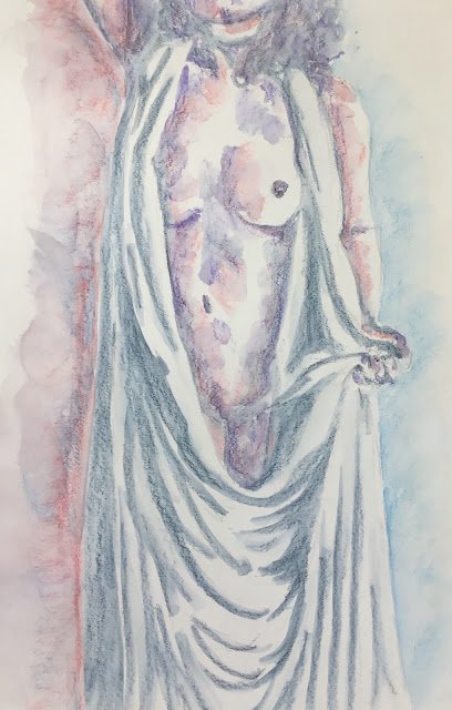
I wasn’t in the mood for a long day of painting today, so decided to have another go at a figure drawing with the inktense pencils while the lessons from my last attempt about not using too much pigment and sculpting the body with my brushwork were still fresh in the memory. Today’s model is Jennifer Evie, making her debut.
For the initial pencil drawing, I uses a 7×5 grid to help me get everything in the right places. I was especially careful about drawing in most of the shadows and creases on the thing she’s wearing. I say most because the are places where I just got into the flow and made up my own gestural creases rather than copying the source photo. I think this mix of copying and improvising may actually be better than either of the individual strategies on its own.
My initial plan was to make this a monochrome painting in deep indigo but I changed my mind at one point. I think it was when I got to Jen’s left arm and realised there were no shadows down its edge. I can cope with little lost edges but a whole arm seemed too much to me, so I decided to negatively paint the arm by putting in a background colour. Using indigo didn’t feel right, so I went for bright blue instead. And to keep everything in harmony I put some of the blue into the hair and into any shadows on the body. And because two colours felt wrong to me (either too few or too many), I brought in poppy red as a third colour. I added it to some of the body shadows, generally those on the left of all the individual shapes.
After wetting all the colour, I decided the painting needed some background on the left, so put this in using the rod and the blue. And with a little bit of pigment left in my wet water brushes, I was able to add some very low value marks in a few places. And that was me done.
And you know what? I like this one. It’s an interesting set of colours (just the three; violet was not included, believe it or not). I’ve used enough white space today, there’s some great gesture in the folds, the background (and the way it fades out) looks professional and the clothing, without any red or blue in it, contrasts well against the body. This one’s up for sale. To see the price, click here.


Leave a Reply