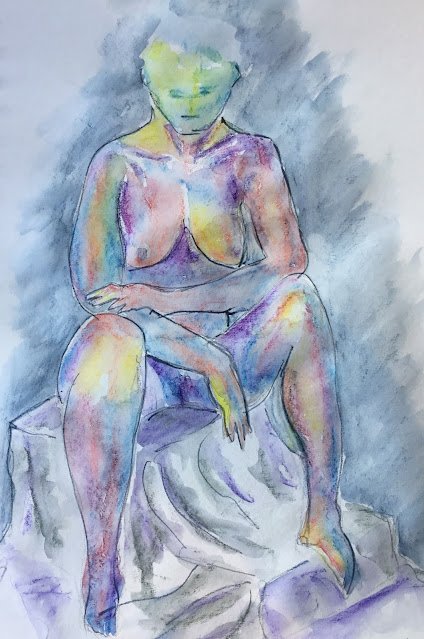
A second appearance for Jenni, drawn using violet, light blue, deep indigo, fuchsia and sherbet…

Jenni
The second bit of figure drawing of the day. This time it’s Jenni.
Back to the colours that work best for me at this sort of thing, with lots of violet and yellow. After the curtain worked so well last time round, I’ve added the box Jenni’s sitting on and a shadowy background.
The best thing about this one is that there’s a tiny bit of Matisse in there. Something about the sweep of the line in her right arm.
Otherwise, not great. The head is too green compared to the rest of the body. And the indigo outlines aren’t really working out. Maybe I’m stuck in that horrible place between accuracy and gestural energy. Neither one nor the other. Either of the extremes (going all out on energy and not caring about accuracy or all out on accuracy and not caring about energy) would be so much better than this middle ground which lacks both.
When I’m famous and sought after, pieces like this will be worth a fortune but for now, this one isn’t good enough to go in the shop window.


Leave a Reply