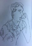
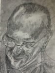
This is the result of one of the exercises in Keys To Drawing by Bert…

Invasion!
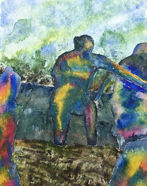
I’m doing two paintings today. Both are based on photos transcribed onto paper by dividing them into grids. Both have the figures masked out, the background painted, the masking removed and, finally, the figures completed abstract-style.
And the first one isn’t a Western for a change. It’s based on a photo of a bunch of mothers from South London doing tough mudder for charity. They raised a fortune. Good for them. Rather than naming any of them in this unflattering painting, though, I’m calling this one Invasion! Think of it as a load of alien zombies about to storm into your local Waitrose.
The three primaries today were French ultramarine, transparent yellow (for good greens) and quinacridone magenta. All three are also used throughout the painting. I also used some acrylic inks in the foreground and background (sepia, sap green and tiny bits of olive green and indigo ). And there’s some Payne’s grey making up most of the outlines of the figures.
In places, I’ve used colours other than Payne’s grey around the outside of figures in an attempt to distinguish them from each other. And I tried to highlight in yellow the main figure’s left arm – an attempt to improve on my usual formula of only thinking about the outlines of figures and not about depth, shadow or anything like that.
There’s lots to like about this one. The green sky is good, with the diagonal stripes adding a bit of energy and the inky background foliage adding a certain something. The colours on the figure on the left are great. And the yellow highlighting of the main figure’s arm worked exactly how I wanted it to. The larger of the two figures on the right is terrible though. You’d think I could get the proportions right using a grid but obviously I can’t. You can see where I’ve added a head as an afterthought in an attempt to make what’s there look vaguely humanoid. I could always remove that figure with some tactical cropping but that wouldn’t solve the biggest problem here, which is the middle ground. The colour is made up of the three primaries, which is good, but I’ve made it much too dark and there isn’t enough contrast there against the figures.
This one has been cut up to use as collage material.


Leave a Reply