It’s been a couple of years since I picked up three Daniel Smith Primatek colours for Christmas and I’m ready now to discuss their future.
First up, Mayan blue genuine is a great cool, granulating blue and has earned a place in my main palette of 18 colours.
Then there’s green apatite genuine. It’s an interesting colour, granulating and separating into different colours. It’s like a Schmincke supergranulator. In fact it fits better with them than in my main palette. So I’ve replaced it in my main palette with Payne’s grey. My Mijello palette has 14 rectangular wells and four triangular ones in the corners. I can now have the four opaque colours (cadmium yellow, cadmium red, sepia and Payne’s grey) in those triangular wells, which feels neat and tidy to me. And the green apatite genuine now sits in my supergranulating palette. Along with forest brown it provides the dark greens that the generally light valued Shire supergranulators are so desperately lacking. Green apatite genuine has a future.
Which brings me on to hematite violet genuine. It’s still there in my palette but will run out at some point, and that’s when I’ll be replacing it with Potters’ pink. It’s almost a like for like substitution, with both having a bit of red to them but neither being super warm. And for both of them their main purpose in life is to impart a bit of granulation and texture to other colours. But the pink is a lot cheaper, so will be joining the team at some point.
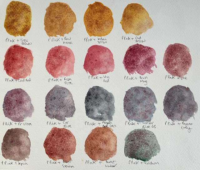
In fact I’ve already bought a tube of potters’ pink and was in the mood this afternoon for some swatching, so I’ve been taking a look at how it mixes with all the other 17 colours it will be sharing a palette with.
First up, I swatched the pink on its own:
I don’t know why I did this really, as it’s not a colour that I’m expecting to ever use on its own. Still, you can already see that it likes to granulate. This was all done on the back of a rough textured sheet of watercolour paper.
Then I tried mixing the pink with my yellows:
In all four cases there’s some colour separation going on, which augers well. It’s least visible in the raw sienna mix, probably because both colours there are less saturated, earthy colours. And comparing these colours to
the results of mixing yellows with hematite violet genuine, you can see the difference between how the pink generates colour separation whereas the violet leaves lots of tiny black specks in the mix. Two different effects, neither one being “more right” than the other.
Then we come to the reds:
The colour separation doesn’t show up much here, what with everything being similar in hue. If anything, the cadmium red (because it granulates) and the quinacridone magenta (because it’s a vaguely more distinct hue) work best with the pink. Hematite violet worked better with the reds because the black particles showed up. Maybe I just won’t bother mixing potters’ pink with reds.
Then the blues:
And there, my friends, you see potters’ pink at its best. Colour separation absolutely everywhere. I expected the French ultramarine mix to look good as it’s what tundra pink is based on but the cerulean blue and Winsor blue green shade mixes may be even better. I’ve mixed up some quite grey looking shades but I guess I could use more blue in the mix to get something bluer with the colour separation still going on. Whatever I decide to do, these just look amazing.
I could just stop there and be happy but let’s look at the browns:
Not a great deal to see here. Just like with the reds, the similarity in hues means that the colour separation doesn’t show up much. If anything, the mix with sepia looks like it has the most potential. Looking back at the cadmium red, cadmium yellow and Payne’s grey mixes, the opaque colours seem to have generally exceeded expectations.
And finally there’s viridian, my only green:
I expected this mix to be a good one and it is. Green and red are easy to tell apart if you’re not colourblind and viridian is a big time granulator. This one reminds me of desert green, which is a mixture of viridian with cadmium red.
So it’s looking like potters’ pink will be a great addition to the team if I mix it with greens, blues and maybe yellows. It will give me interesting options. But for now it remains on gardening leave, waiting for me to finish off the hematite violet genuine.


Leave a Reply