


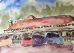
This afternoon I took a stroll down to the Tuck Inn, my local purveyor of…
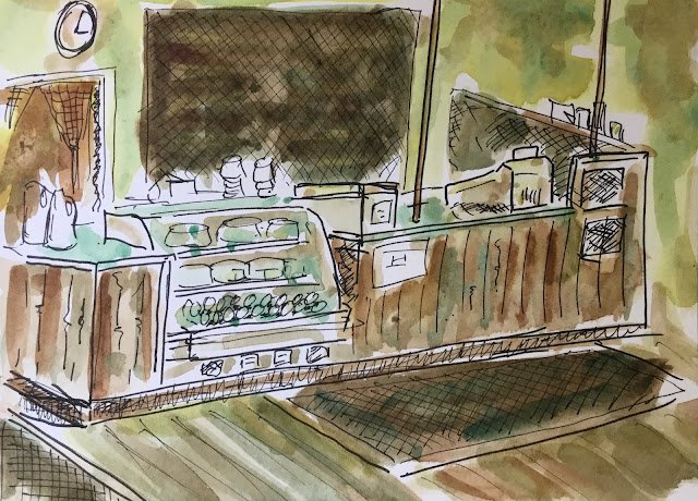
Inside The Tuck Inn
After doing two drawings from the other side of the road opposite the Tuck Inn, I was ready to step inside and enjoy a milkshake while doing a third drawing. What I didn’t know until today was that the Tuck shuts at 3pm, so I only had 10-15 minutes to do my drawing. So it’s another rushed drawing and the perspective’s wrong in a couple of places. I’m starting to notice that the more I rush, the more my drawings start to look like the work of Quentin Blake or Bill Tidy, two legendary artists.
Anyway, I did manage to finish the drawing and the milkshake in time for people to get off home. I wandered back home with my three drawings, chose the colours for the first two, changed my colour randomiser (reclassifying raw sienna and Winsor orange as yellows) and ran it, only to be presented with this set of colours:

With no red or blue, it’s a slightly underwhelming set of colours. On the other hand, the transparent yellow would enable me to add a bit of brightness. I was hoping that the burnt umber and viridian might mix to give a nice dark, neutral colour, but no such luck – they just gave a dark greeny brown.
So I just did the best I could with these colours. I tried to brighten up the walls with transparent yellow but had to add a bit of green and brown to bring them under control. For the front of the counter and the floor, I added some random stripes of green and brown to give the impression of separate planks.
I’ve need up with something dull looking that the Tuck won’t thank me for. Please remember the computer chose these colours – I didn’t. The Tuck is a much more welcoming place than this painting would suggest.
Leave a Reply