


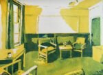
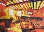
Back to Christ's College tidy for another indoor landscape. This is a room in…
Inside New Court, Christ’s College
I needed to paint something other than portraits and, while looking around my Cambridge college’s website, hit upon the idea of painting the inside of a room. This is one of the rooms in New Court, a building I thought I’d painted a couple of times but that it turns out I’ve painted five times before! I’m not sure whether this counts as a landscape or whether it’s just a still life. I think it has definite still life vibes. I’ve also identified a couple more college rooms that I might paint another time.
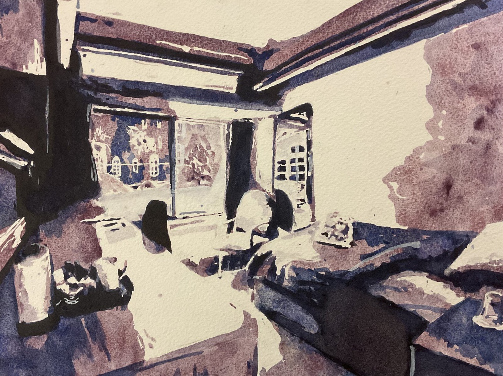
I’ve used the Notanizer app again. This is the first time I’ve used it for anything other than a portrait. Paintings of rooms look very different in notan to portraits. The shapes are smaller and more intricate. Some of the plans I’ve seen of rooms remind me a lot of Charles Burns’ graphic novels.
With these notan paintings, the values do all the work of “getting the likeness”. With the colours not needing to be realistic, I can just use them to set the mood. I decided quickly that I’d be using supergranulators as their texture is well suited to a building that’s predominantly made of concrete. I went for the tundra colours again (for the third successive painting) not only because they suited the cold brutalistic architecture but also because I thought cool blues and purples in the darker areas might make the lighter while and pink areas look warmer – I’d picked out a source photo with a lot of sunlight coming through the window.
I followed the usual procedure. Pencil outline and reserved whites, a layer of tundra pink, a layer of tundra blue and a layer of the tundra violet.
Tundra violet gave me big problems today. After I put the first layer down, the mars brown in it was coming through really strongly as it dried. In retrospect, I think this is just due to the brown and the blue in the mix drying at different rates and that the brown notes would have disappeared if I’d left well alone. But instead I panicked and kept charging in more colour and dropping in bits of water, just to try to make it do something different. It just made the brown notes stronger and created cauliflowers. Whenever I tried to paint over the top, the browns and cauliflowers kept reappearing without me doing any tinkering. Eventually, I hit upon the idea of wetting all the darks and lifting paint and drying with kitchen paper. Then I went over the top of the resulting mess with more of the tundra violet. I don’t know what has happened but I’ve ended up with a dark, opaque, boring colour. Maybe I’ve damaged the sizing on the paper. But it’s better than what I had before.
I also did a little bit of tinkering, adding some more blue and pink and white gouache in an attempt to make some of the shapes clearer. I think that’s more important in a detailed painting like this than in a portrait. In some places I’ve only hinted at shapes by using a very watered down pink: it’s like a fifth value in a four value painting.
There are some bits about this one that I like. There’s the negatively painted chair in front of the mirror and the hot sun on the desk. That tundra violet drags everything down a bit for me but this painting got great feedback on Facebook, so it’s going up for sale. To see the price, click here.

Leave a Reply