It's looking grim outside, so I thought I'd try out those inktense pencils. It's hard…

Inktense Pencil Squad Tinkering
I’m taking a day off from painting, so here’s a post with some swatching.
I saw that Jacksons were doing deals this week on inktense pencils, so I jumped in and did something I keep thinking about but have never gotten around to until now. I tinkered with the makeup of my inktense pencil collection.
Out went:
– tangerine, chilli red, poppy red and Shiraz, all of which have lightfastness issues. I’m especially sad to see the back of the Shiraz, which I really liked. Red is definitely a common theme when it comes to lightfastness issues with inktense pencils.
– white, which I’ve never found a use for. Maybe it would have worked on coloured paper?
– the outliner, which I don’t see the point of. Normal pencils do just as good a job on outlining but are much easier to rub out. I’ve heard the outliner is good for line and wash paintings but I’d rather use fine liner pens for them.
In their places came:
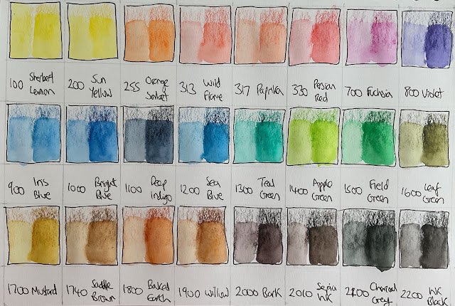
– orange sorbet
– wild flame
– paprika
– Persian red
– saddle brown
– sepia ink
I’ve swatched out all 24 colours in my new squad. The orange looks like a like for like substitution (with a big improvement in lightfastness). I’m glad to see I still have a proper red in the Persian after losing the poppy and chilli reds. I’ll miss the Shiraz but paprika and wild flame look like they could add flesh tones to my arsenal, something I’ve not had before or even realised that I didn’t have, such is my attitude to colour matching. And the white and fine liner have been replaced by two more dark colours that look interesting. In particular the sepia could make some great, old fashioned looking, monotone paintings.
I’m looking forward to my next inktense session.


Leave a Reply