


And here it is, the first of a series of paintings based on my home…
In From The Storm
The news came through last night that two of my paintings that were on display at at the Rose & Crown have been sold. So I needed to find a couple of replacement paintings of Hartlip or of Queendown Warren to fill the empty gaps. One of those sold was in portrait format and the other in landscape format. My first painting of Thatch Cottage should be OK as the landscape format painting but I couldn’t find a suitable portrait format painting – I’m pretty choosy. So I’ve had a go at a portrait format painting today. I may have a go at a landscape format painting later this week, and should probably do some more local paintings after that so I have some on standby for when more are sold.
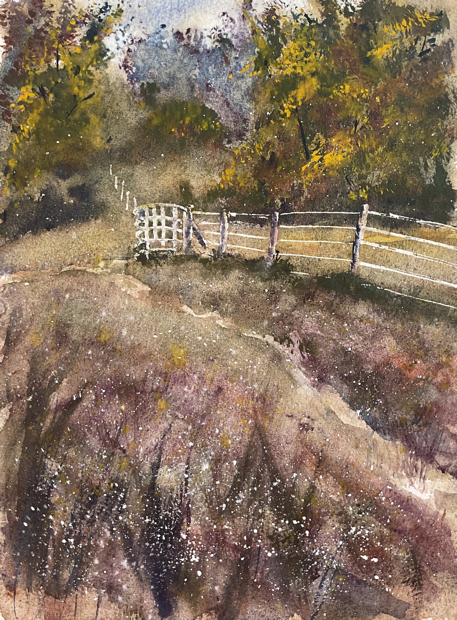
As both the sold paintings were of Queendown Warren I thought I’d better do another Warren painting. Looking through my photos, this was the best portrait format Warren view that I could find, so I went with it. I was feeling under a bit of (self generated) pressure to make this a good one, so resorted to one of my cheat codes and painted this using the tundra supergranulators. I used all five tundra colours (tundra violet/blue/pink/green/orange) plus cadmium yellow for a bit of warmth and life and a bit of white gouache at the end.
The initial pencil drawing was pretty rough and ready, with the exception of the size and positioning of the fenceposts, which were accurately measured with a ruler. No NeplucidaXL assistance today because of that pressure to get it right. After marking down the outlines, I masked out the fenceposts and wires and spattered over some masking fluid, mainly in the foreground.
Once the making fluid was dry, I got to work on the colours. Most of this was done in three layers:
- a loose underpainting using all five tundra colours plus cadmium yellow, just putting colours down where I fancied except that the violet was only used in dark areas, the yellow only used in the trees and in the background grassy areas and with only the pink and blue being used in the sky
- once that was dry, a second layer was added, trying to map out the value shapes (the trees, the diagonal path, the left to right) and to bring out a value difference between the grassy bits in the top and bottom halves of the painting
- and once that second layer was dry, the third layer was all about textures: leafy textures in the trees and the addition; of grassy marks in the foreground, at the bottom of the fenceposts and anywhere else where they were needed to keep the painting balanced. I spattered on some cadmium yellow in the foreground at this stage to balance the top and bottom halves. I also spattered on some white gouache but this was a waste of time as I’d already reserved white spatters with masking fluid.
Once the third layer was dry, I removed all the masking fluid and considered whether any final tweaks were necessary. I decided to add some colour to the fence posts and to add some dark branches in places in the trees. And that was me done.
I’m happy with this one. It’s definitely good enough to go on display at the Rose & Crown and I’ll be framing this one and Thatch Cottage as soon as I’ve finished all my writeups and taking them over the road. I think this is the first time I’ve been genuinely loose with the tundra colours and it was great fun. Using the tundra is like having a safety net: I can be as loose as I want and I know it will still look good because of those colours. It’s interesting that, while this one feels a little chilly, it doesn’t feel freezing cold. And it also feels green but I didn’t use excessive amounts of tundra green: look closely at those greens and you’ll see a lot them are violet, orange or (most of all) pink.
Short of inspiration for names, I picked out the name of a track recorded by Jimi Hendrix.
And this one was sold within 24 hours.
Leave a Reply