


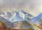
And here's the second snowy painting of the day. Brought to you by the colours…
Icelandic Mountains
25 October 2014
This was based on a photo I’d seen of some mountains in Iceland. If you compared the painting to the photo, though, you’d not be able to tell they were pictures of the same mountains.
I experimented a bit with clingfilm on this painting, scrunching it up and pressing it against the paint while it was drying. It seemed to work and I should try it again at some point now that I’m a better artist. If I could change one thing about this painting, it would be the pencil work. It needs to be a bit more in your face: pressed harder, softer (darker) and just a bit more straight/jagged rather than trying to be smooth and not upset anybody. Part of me wonders whether the colours are a bit too silly & vibrant and part of me thinks they’d be the thing that made the painting interesting if the pencil work was better.
In the end, not one worth framing. I think it’s still in the folder.

Leave a Reply