29 June 2018 And now a genuine abstract. What can I say about this one?…

I See A Red Door And I Want It Painted Black
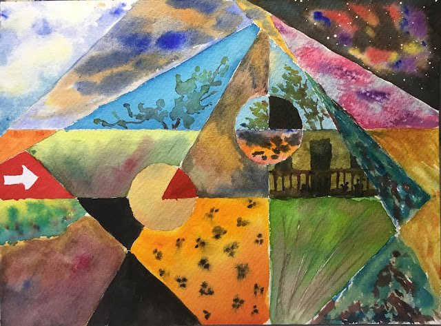
Where do I start with this one? Well, I’ve been thinking of doing something like this all week, dividing the paper up and doing lots of little paintings. Some of those little paintings were planned in advance, others just came to me on the day.
I make it 23 colours that were used in this one: French ultramarine, Winsor blue (green shade), cerulean blue, Prussian blue, Winsor violet, quinacridone magenta, permanent rose, permanent alizarin crimson, Winsor red, rose dore, Winsor orange, Indian yellow, Winsor yellow, transparent yellow, lemon yellow, sap green, olive green, green, raw sienna, burnt sienna, burnt umber, sepia and ivory black. So this is definitely not in a particular colour key.
I start by dividing up the paper mathematically. There are points on the top, left and right edges from which lines radiate that divide up those edges according to the golden ratio. The points on the sides send out lines at 45, 90 and 135 degrees. The point on the top edge sends out lines at 30, 60, 90, 120 and 150 degrees. I also added a couple of circles centred on points where lines crossed to break up some of the bigger shapes. Then, finally, I erased edges in a handful of places to make some of the shapes mor interesting.
I can’t remember what was used where but there are a few little bits worthy of comment:
– the leopard spots were something I’d planned in advance. The background was Indian yellow at the top and Winsor orange at the bottom. The two were barely distinguishable, so I added some Winsor red at the bottom, which worked really well. Those yellows and oranges need to take centre stage in another painting at some point. The spots were added with sepia which, being opaque, doesn’t spread out of control when used wet into wet.
– there’s a space pic in the top right, using my well established methods. The background was black with a bit of Prussian blue to make it not look too dead.
– there are three panels with the tops of trees. This was a chance to use a technique I recently discovered on YouTube, where you spatter or spray on some drips of water, drop colour into the drips and join them together. For this painting, I just dabbed on those water drips. It’s worked really well though.
– there’s a nice panel with cerulean blue, permanent rose, Winsor violet and salt, taking inspiration from The Happiest Days Of Our lives from last year.
– the bottom left panel was a bit of a fail. It started as an attempt to draw the back of an elephant, using the Hazel Soan techniques that I’ve talked about before. It didn’t work out on this occasion though – I think it works best with whole elephants rather than closeups.
– the two blue/green panels on the right were an attempt at a waterfall. They’ve ended up as something else now. And the two panels to the right of them attempt to channel that downward motion.
– the PacMan shape was deliberately chosen as flesh colour and the sector within it as lip colour.
– there are three pure black panels. Two of them look like a woman’s figure. This seemed like the right thing to do after painting the PacMan head. I was happy to have this black looking dead.
– the white arrow on the red background was the last panel to be added. I wanted something man-made rather than natural. Putting an arrow in there raises all sorts of questions in the viewer’s head, which is a good thing.
There were three objectives in the choices of sub paintings:
– to distinguish the top from the bottom. Grass at the bottom, sky at the top, etc. Apart from the semicircular sunset which is a bit too low, bringing me on to the third objective…
– to create jarring contrasts, both in terms of colour clashes and in contrasting the natural world against the human world.
And what have I ended up with? Something that looks great and that may or may not have hidden messages. It feels like there’s something there that’s taking over the world. Is it the human race? Or is it women in black dresses? Or women in leopard skin coats? Or is the world being taken over by black? And, if it is, what is black supposed to signify? I wish I knew the answers to all this.
The title for this one is from Paint It Black by the Rolling Stones. A song that mentions doors painted black, girls dresses on their summer clothes, looking into the setting sun, flowers, green seas turning a deeper blue, the sun blotted out from the sky,…
This one was sold within an hour of going up on Facebook. To someone who likes to paint his walls black!


Leave a Reply