


Ok, let's have one more book review. This was the first book. I read after…
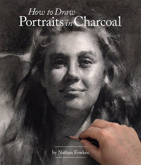
How To Draw Portraits In Charcoal, Nathan Fowkes – Book Review
It’s only the 28th of December and I’ve finished another of my new art books. I need to slow down and read a novel or two on the kindle before reading another art book.
Today’s review is of How To Draw Portraits In Charcoal by Nathan Fowkes. It’s a 180 page paperback with shiny pages. Structure–wise, we’re looking at about 35 pages of introduction and generalities, 65 pages of specifics and a 90 page gallery showing off Nathan’s work. Let’s talk about those three chunks.
So, yes, we have about 35 pages at the front on general stuff. There’s plenty in there about equipment. I don’t mind this as there aren’t that many books around about charcoal: it’s when every new book about watercolour keeps going over the same old ground that I get grouchy. There are four “challenges” presented to the reader as a sort of trailer for the rest of the book. We all need to practice a lot, work within strict time limits, use a limited range of values and train our eyes to look for and see what we need to be able to paint a portrait. But the most interesting bit to me in these opening pages was a set of five short demonstrations showing us how Nathan works. An outline in orange coloured pencil, then down with the darkest shadows, then blend those shadows over into the mid tone and even light areas using whatever’s handy. That’s useful to know. Without reading this I might gone over the mid tone areas with more charcoal, albeit with gentler strokes. There’s a small red light flashing at this stage though. By setting out his demos without outlining his process first, it already feels as if Nathan’s not wanting to bother with all the less important stuff. Why tell us the process when we can watch what he does five times?
We then get to the 65 pages of meat, with chapters on structure, simplicity, values, edges, composition and common mistakes. I’m again getting that red light about Nathan being a lazy teacher: in the chapter on structure he talks about the Reilly method for drawing the face but doesn’t tell us how that method works. I’m having to add another book to my wishlist to explore further. Or maybe Nathan’s just aiming this at highly experienced artists who know most of this stuff already. The rest of these 65 pages are better and there are definitely some lessons there. The places where I learned the most were where Nathan compared his drawings either to source photos or to students’ attempts at the same drawings. Some of the points he makes are so subtle that I’d never have understood them without seeing these examples. And I’m feeling even more now that this is a book aimed at experienced artists – these are tips on how to turn very good portraits into great ones, not acceptable ones into good ones.
And a quick word here for the biggest lesson I got from the book. It’s one that’s easier to understand if you’re a mathematical physicist. We’re shown examples of portraits by students who have followed Betty Edwards and drawn what they see rather than what they thought they should have seen. They ended up emphasising the difference between light and dark areas within shadows or within the light side of the face. Instead, the lesson seems to be that we should start by drawing what we think we should see. Start by drawing the head like an egg and shading it like an egg. And only after that, bring in the next level of accuracy by making some bits of the light or dark sides slightly lighter or darker than others, but with these value differences not as big as the value differences in our original egg shading. And then after that, add some tiny details with a pencil. Like I say, it helps to be a mathematical physicist to understand this. I’ve come up with approximate “first order” solutions to equations that get most of the job done, then calculated “second order corrections” that get us closer, and even third order corrections after that. Not brilliantly explained, I admit. Nathan doesn’t explain it brilliantly in words either, but the examples he shows us get the idea over better than words ever will.
And then the book peters out into a 90 page gallery. I guess that after reading the rest of the book I can look through these and see examples of Nathan’s ideas in practice but that’s because I’ve got a few years’ experience under my belt. But I don’t think beginners would get anything from this gallery. And, to be honest, just a few words under each drawing bringing our attention to some particular feature would have been of value to all levels of artist.
So it’s an interesting book. It’s not a great introduction to charcoal portraits. I’d recommend that artists instead head for the Bill Maughan book on portraits and the Kate Boucher book on charcoal. Together, those two books would give a solid grounding to someone planning on exploring charcoal portraiture. The book does have useful stuff in it, though, for more experienced artists and I applaud this. At some point there will be nothing left for me to learn unless people like Nathan Fowkes and Patrick Jones keep writing books that assume we’re not stupid, that we know almost everything already and are only interested in turning very good works into great ones. So I am glad to have this book on my shelf. It’s definitely worth the money. Having said that, though, I didn’t feel there was enough content in there for me to be able to describe it as a “really good book” (and the extended gallery section doesn’t help in that respect) so it doesn’t get that hard–to–earn fourth palette. It gets a highly creditable three, though, along with a warning that this one is only for experienced artists.
⚠️ Warning! 🎨🎨🎨 ⚠️ Danger!
You can find this book and more reviews of it at Amazon UK here. As an Amazon Associate, I earn commission from qualifying purchases but this costs absolutely nothing extra to you.

Leave a Reply