


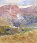
25 October 2014 This was based on a photo I'd seen of some mountains in…
How Do Mountains Hear?
It’s that time of year when I need to start thinking about the next call for entries to portrait Artist Of The Year. And that means I need to come up with the annual self portrait. So how did I get on?
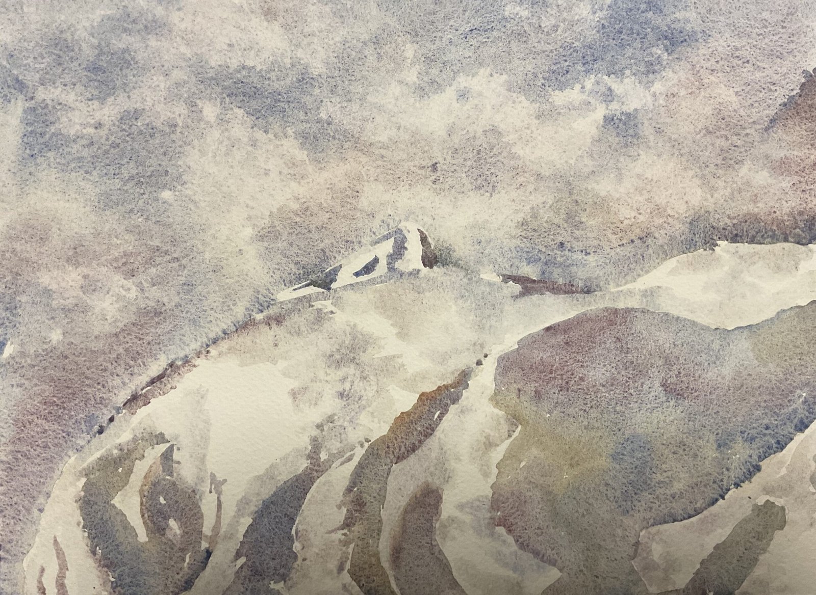
I decided that I’d have a go at a self portrait disguised as a mountain landscape. It’s imaginative enough style to create paintings with a decent chance of making it on to the program, so why not? And I went for four tundra colours (the orange, the pink, the blue and the green but not the violet) because I know they suit this style perfectly.
I took lots of self portraits using the iPad before I finally found one that looked as if it would work as both a landscape and a portrait. I put it through the Notanizer app, looking for a two value plan that captured most of the likeness and that could be improved by extending to three or four values. I did find a suitable plan but it was one with more highlighted areas in the face than darks. So I decided to deviate from my previous process and didn’t mask out all of the highlights. I masked out a few around the eye, where I needed detail and accuracy, but otherwise just left pencil marks on the paper to divide up the darks and highlights.
I wet the sky and painted in some blues, oranges and pinks but no greens. I added more of the colours wet into wet and allowed the colours to mix on the paper. I even worked with the paper tilted up for once and this definitely helped. I removed the beads of water at the bottom of the sky with a dry brush and dabbed out a few wispy white shapes with kitchen paper. Then I was ready to move on to the mountain side.
For my previous two mountainside portraits, with masking fluid there to protect the highlights, I was able to be fast and loose applying the paint. But today, having to work within pencil outlines, I could be loose but not fast, and I think this shows in the hardness of some of the edges and in the lighter values that I’ve ended up with. At the same time as adding all these dark shapes, I added in the mountain in the top right where my shoulder would be. In all of these shapes, I used all four colours, fairly randomly and letting them blend into other. And I achieved some great effects. During this phase, I refused to think of the painting as a portrait: it was a collection of shapes or, at best, a landscape.
Then the masking fluid came off and, as usual, I needed to add in some mid tones. I used the Notanizer app to help me identify suitable mid tone areas, then mixed up really watery versions of all four colours and applied these randomly in the mid tone areas, taking care not to overlap the darks that I already had down. I stepped back a few times to view the painting in portrait mode and to see whether a likeness was emerging. I thought this second layer of paint was competing too much with the first layer, so I dabbed it with kitchen paper and this calmed it all down to an acceptably low value, And, yeah, that was me done.
So, is this good enough to be the 2026 self portrait? Well, there are some marks down the side of the temple and in the ear that seem slightly darker than the other darks. And there’s a row of blue spots in the sky above my neck that curve parallel to the neck. And my mouth is indistinguishable within a dark shape that includes a shadow down one side of my face. On the other hand, when I turn the painting ninety degrees to portrait format, the resulting painting has a lot of personality in the upturned chin and in the way I look as if I’ve been sculpted from ice. I’ve definitely caught something.
After sleeping on it, I decided that this wasn’t going to be my 2026 self portrait. Keep reading.


Leave a Reply