


I wasn’t very good at painting and not that committed to improving. I would have…
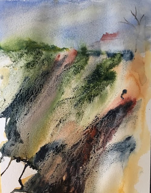
Horsehead Quarry
I thought I’d try something different. After checking out some Jean Lurssen videos on YouTube I thought I’d invest in some acrylic inks and have a go at some abstract landscaping. I threw down some random watercolours, made them wetter, tilted the paper around to make them run. Then added some bits of acrylic ink, dripped some granulating fluid on the ink and tilted the paper again. Finally, I added a bit of detail at the top of the cliff.
Watercolours on the cliff side are just burnt sienna and transparent yellow. I added in some sap green, indigo, earthy red and sepia inks. And above the cliff line, there’s French ultramarine in the sky, French ultramarine and Indian yellow in the greenery and cobalt blue, cadmium red, sepia and titanium white in the house and tree.
I’m more than happy with this as a first experiment with acrylic inks. Fogging out the house at the end was a good move – before that it stood out too starkly against all the abstract stuff around it. I’m also happy with the Jean Haines style dribbles against a white background in the bottom left. Oh, and there’s a random horse’s head there on the cliff face. Its eye is up in the top left. Oh and a huge one on the right with an eye just below the house. This one will definitely be framed and put up for sale.
Materials-wise, I used Daler Rowley acrylic inks. As well as sepia, indigo, earthy red and sap green, I’ve got olive green standing by. I might need to invest in some white at some point and maybe some sort of yellow. There’s a hexagonal wooden box you can get in The Works for £3 or £4 that fits seven DR ink bottles perfectly and I’m kicking myself for only buying five.
Leave a Reply