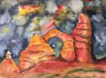
This is High Cup Nick, a huge chasm up in the Pennines. I've been meaning…

High Noon
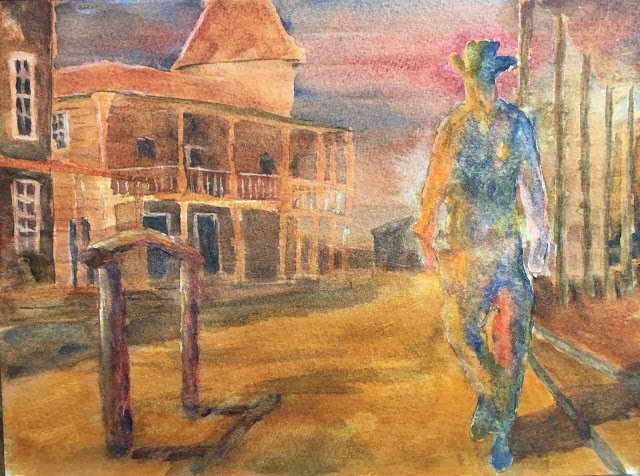
With not many ideas about what to paint and not wanting to keep doing abstract after abstract, I thought I’d have a go at another famous Western. Today it’s a scene from High Noon.
The colour key today was warm orange, with the main colours being Indian yellow, rose dore and French ultramarine. It’s not a colour scheme that gave a great swatch at the start of the summer but I thought I’d give it a go anyway, given that a Western scene will generally be warm and orange. They weren’t my only three colours today though.
After masking out Gary Cooper and painting in the sky (with a dark cloud deliberately put around his head to add a bit of mood, I painted the whole foreground and middle ground with a raw sienna glaze. It felt like the right thing to do, adding a dry, deserty feel to the painting before I’d even started. I also did a bit of underpainting on the buildings, using my primaries to create interesting shadowy colours in the shade and brightening things up with Indian yellow where they were in the sun.
And then I got on with painting all the middle ground and foreground (but not the figure at this stage) using my three primaries to create neutral colours and to vary them around rather than keeping them fixed all along the same face of a building. I also used some titanium white for window frames and balcony posts. I then painted in the figure in abstract style using the three primaries. Today, rather than going for the outer space look, I used the primaries to try to be a 3D effect, like in my Butch and Sundance picture a while back. I also tried to hint at a sheriff’s badge, a belt and a v-necked waistcoat.
But then while waiting for the figure to dry, I noticed a couple of problem. First, the painting was looking too colourful. Not something I normally mind, but this seemed at odds with the painting’s roots in a black and white film. And second, the figure didn’t stand out enough against the background. So to tone down the background and to offset it against the figure, I glazed over the whole background with Burnt sienna. It’s a shame that beautiful blue sky had to go, but needs must. I also added a few more tweaks, repainting the horse bar (on top of the burnt sienna glaze), adding white highlights to it, adding white highlights to one side of the figure and giving the figure a good dose of salt (being careful not to get any salt on the background). The highlights all looked too bright so I tried to wet them out without making milkshake. The trick was to brush the underlying pant into the white and not the other way round.
And in the end, hmmm… Perspective looks off. It all looks cold, as if it’s a fight at dawn rather than at noon. And the figure isn’t distinct enough against the background. There’s a strange glow around the figure’s right arm which could be a good thing or a bad thing. What is good though? Bits of the figure (the legs and the hint of a badge). And that horse post on the left is great – it really stands out against the background. In fact, if I crop out Gary Cooper, the resulting painting with the post as the main subject looks great. And I never used to be able to draw boring foregrounds but there’s just enough variation in that road to make it interesting.
It’s up for sale. To see the price, click here.
Oh, and this got a like on Instagram from Gary Cooper’s daughter, Maria Cooper Janis!


Leave a Reply