


I wasn’t very good at painting and not that committed to improving. I would have…
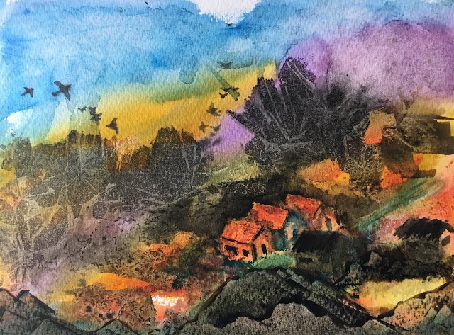
Hidden Village
This one’s taken me a couple of days. After reading Ann Blockley’s Watercolour Workshop, I thought I’d have a go at painting a random abstract, then trying to draw a little reality out of it, and this is what I ended up with.
I started yesterday with some random vaguely diagonal stripes of blue, violet, yellow and orange. To do this I used pthalo blue, quinacridone magenta (only in the violet), rose dore and Indian yellow. I then spattered on a little bit of sepia and painted on some geometrical shapes in sepia. According to Hazel Soan, sepia doesn’t spread too much when applied wet into wet, so that’s why I chose it. Then I added some clingfilm to the top half and crinkled it up. And added one of those net bags that lemons come in to the bottom half and weighed it down with bricks.
After it had dried, this is what I ended up with. I can see some red and green buildings in there.

When I looked at it upside down, I could see a church on a hill:

What to do? Well, I had a ponder overnight and decided to go with the buildings. The plan was to use opaque colours (sepia, cadmium yellow, cadmium red, cobalt blue) to negatively paint around the buildings and to bring them out. The only opaque I ended up using for the negative painting was sepia. I also used sepia and the transparent colours to add some windows, doors and shadows. And some sepia to convert some of the blob stuff in the sky into birds.
There were some bits on the road at the bottom that I didn’t like, so I added some Terry Harrison rocks at the bottom. I first painted them using burnt umber and raw sienna. Then I added a really thick layer of French ultramarine and burnt umber on top and scraped it away using an old credit card. For once Terry’s rocks came out OK for me. It’s not up for sale though.
In the end it’s OK I guess. The buildings at the bottom are a bit too dark for my tastes and I should have just left them green. The rocks, while they came out OK, stick out a bit as not being as abstract as the rest of the painting. On the other hand the birds look good and the clingfilm and the geometrical shapes in sepia have resulted in some good background trees. It might all look better cropped down a bit on all four sides. We’ll see.
And I learned something about colours on this one. Pthalo blue is putting in a really strong case to be promoted to a spot in my 16-pan palette. Maybe at the expense of cerulean blue or maybe even (whisper it) in place of Prussian blue. Even then, cerulean blue is under strong pressure from turquoisey colours like viridian. The other colour discovery is that cadmium yellow is looking way too strong compared to other colours on my palette. One little bit of it on the paper was enough to convince me to restrict the opaques to sepia today. I do need to keep thinking about what to do with my palette.
Leave a Reply