


I've had a day out at Rochester Castle today. I had plans to head out…
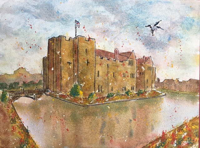
Hever Castle
With the whole day available for painting today, I’ve finally completed a watercolour in the studio. Without wanting to take much time planning, I went for a view of Hever Castle that I’d been planning on painting in a certain style as practice for being a wildcard at the castle in June. We now know I won’t be a wildcard but that’s no reason to not go ahead and paint the castle anyway and to show what StoryVault teams are missing out on.
This is in the key of green warm, the three headlining colours being cerulean blue, raw sienna and rose dore, all colours that I could see in the stonework and that I thought might work together. I’m not convinced by this combination, and (weirdly for a cool blue and cool yellow) I found it doesn’t produce great greens. Cadmium red, cadmium yellow and titanium white all came on as garnishes later and I admit I did reach for the French ultramarine to help me with the dark colour in the bird and with some of the greens.
I started with drawing in some outlines with fineliner pens. Looking at the final result it’s clear this didn’t work out. Maybe the problem was that the castle was a boring shape with too many vertical lines. Or maybe the problem was that I was to careful to paint up to the boundary when painting both the sky and the castle: with fineliner outlines it’s better to be a bit more loose to avoid getting a colouring book feel.
And then I added all the colour, working from the back to the front as usual and applying a number of layers to the castle and the foreground. Again the castle’s not quite right. Maybe one of my early layers was too thick. Or maybe I was putting down too hard a distinction between left and right facing surfaces.
The reflection worked out brilliantly though. It was the think that attracted me to this scene to start with and something that I thought needed practising before LAOTY. It’s a shame the reflection and the sky are wasted on a painting with that castle in it.
As finishing touches, I stabbed in some flowers and yellow tree highlights with opaque colours. And added a bird. And some opaque spatters to try to distract from that poor attempt at painting a castle. And I even added some highlights with a white gel pen. And that was me done.
And you know what? Even with the best water I’ve ever painted and one of my better skies, this one’s going into the reject pile. It looks ok from a distance but, close up, the colours in the castle are too dark and the wrong tint. And the black outlining brings everything down further. No, not for me Clive.
Leave a Reply