


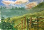
Back to the artwork after a few days off, and this is looking like an…
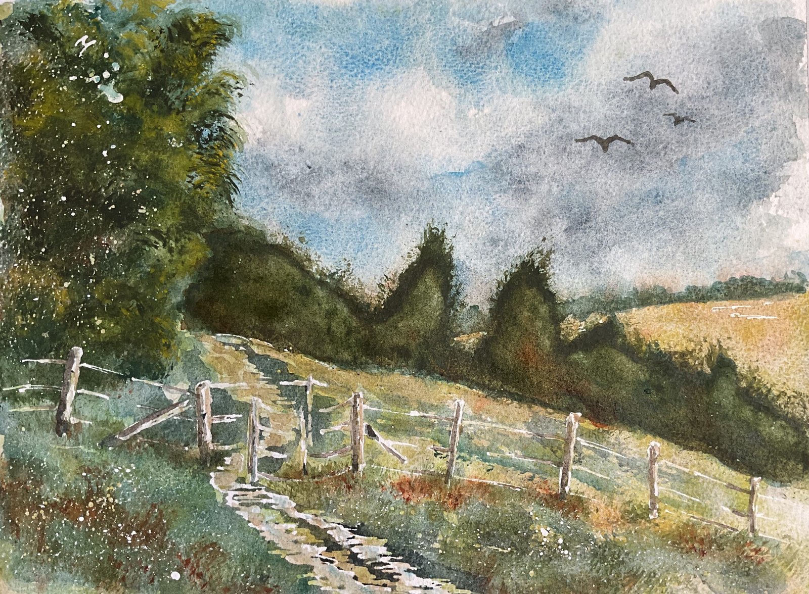
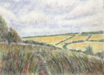
Heading Home, Queendown Warren
I wanted to try something different today. I’ve had a go at doing a conventional landscape painting in three glazes using the Notanizer app. The app gives me great results for portraits and for what I’ve been calling indoor landscapes but what about the wide open country? I picked a view on Queendown Warren that I go past on my daily four mile walk on those days when my walk doesn’t have to include a visit to the local farm shop.
For the colours I picked the Shire supergranulators and supplemented them with their five best friends: green apatite genuine, forest brown, cerulean blue, burnt sienna and cadmium yellow. Ten colours in all, which is a lot for me.
So the process today was to:
– put down a rough pencil outline without using a grid (but with some tiny pencil marks around the outside of the paper where the ends of the grid lines would have been)
– gently rub a candle along the foreground for some texture
– mark in some highlights, including the fence posts, and spatter on some more masking fluid in the foreground and middleground and in the big tree
– although the Notanizer was telling me to leave it white, wet the sky area, apply cerulean blue leaving white clouds and add Shire grey wet into wet for some dark clouds
– paint over all the light, medium and dark areas with a glaze of Shire yellow, Shire green and Shire olive, varying the colours; add burnt sienna in places to keep the greens under control
– use masking fluid to reserve any small light valued shapes
– paint over all the medium and dark areas with Shire grey and Shire blue, varying the colours and dropping in the odd bit of burnt sienna
– paint over all the dark areas with green apatite genuine and forest brown.
One thing you might have spotted that I did differently today was that I included Shire green in the first glaze rather than the second. I’m still not sure which level suits it best. To be honest I’d be happy with just Shire yellow in the first layer and Shire blue and Shire grey in the second: the green and olive don’t exactly sing the loudest here.
Anyway, that should have been it but I found myself doing some tinkering:
– I added lots of grassy tufts in forest green, green apatite genuine, burnt sienna and Shire grey. This was definitely required, even if it was just to ground the fence.
– some of the white highlights on the path were looking too bright, so I muddied some cerulean blue with burnt sienna and put this over the whites to look like sky reflections
– I added some birds – they always look good
– I added some cadmium yellow marks to the big tree on the left to help it stand out against the row of trees to its right
– and, yes, that big row of trees. I tinkered a bit too much there, trying to get lots of different colours working wet into wet and only succeeded in creating cauliflowers. You can see how the trees are all darkest at the edges where all the water I added kept pushing all the pigment particles outwards.
There’s a huge lesson for me here. If I’m to do these three layer glazed paintings, I need to give up the idea of creating wet into wet effects in any of those layers. This is what made a mess of that row of trees. This probably means that I shouldn’t be using the three layer glazed method for conventional landscapes as subjects like that are always screaming for some wet into wet action and for the paint to create its own patterns. For portraits and indoor landscapes, though, where I need to be more control and won’t be wetting into wet, the three layer glazes are still looking like the way to go.
While I’m less than happy with that row of trees, this is going up for sale because local paintings tend to be popular. To see the price, click here.
Leave a Reply