


I lashed out on another book last week. I don't plan on turning this into…
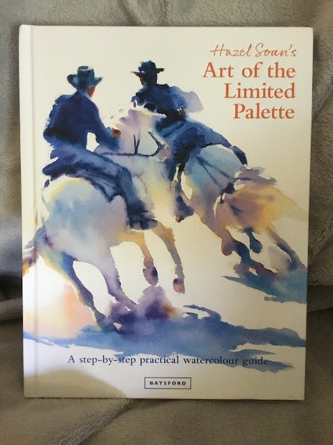
Hazel Soan’s Art Of The Limited Palette – Book Review
This is one gorgeous looking book. It’s a 192-page hardback and the name of the book in the top right has been embossed. I can’t stop running my finger over it.
The book’s all about limited palettes (obviously), a subject close to my heart. In theory about half the book is background and theory, so what’s so good about limited palettes, what the choice of colour will do for the painting and how to choose the colours. Then the second half is all about practice, with examples from landscapes, sunsets, seascapes, buildings, flowers, portraits and wildlife. But actually it all blended into a long story for me, maybe because there wasn’t much in the first half that I didn’t already know, so the book ended up as just one long set of examples.
But those examples are fantastic. So many of them, all inspirational. All of them detailing Hazel’s thought process about which colours she used and why. In some places, Hazel gives pairs of examples with slight differences in colour so you can look at the differences. There are a few demonstrations too, mercifully short and worded as demos and not instructions; they were actually quite good at breaking things up a bit and not letting me rush through the book too quickly.
While I didn’t learn much from the book, I did learn some interesting stuff about how one colour in the palette can make other colours pop. Like how having a really cool blue makes all the other colours look warmer, that sort of thing. But I had lots of the ideas I’ve picked up through experience confirmed and I can see how someone less experienced would learn a lot from this book. I think a bit of experience is useful, though, when you’re reading about Hazel’s colours. When she uses yellow ochre, for example, I’m not only translating that to the raw sienna that I use but also remembering that raw sienna is more transparent, so won’t give exactly the same effects. Hazel uses Schmincke colours, by the way, but that’s not a big deal.
Writing style is sparse, but that’s a good thing in this book. So much of what Hazel has to say is through her example paintings rather than through words. Not many words are needed to make the point and the time saved reading can be spent on looking at those paintings to put the words into context. And Hazel’s voice and passion come through loud and clear.
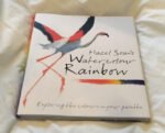
I guess this book will always be compared to Hazel’s Watercolour Rainbow, so I should say something about the two books. I think Limited Palette is a bit more advanced. I’d go for Watercolour Rainbow quite early into someone’s career, maybe when they’re just going for professional colours for the first time and planning their palette. If they’re already past that stage, Watercolour Rainbow is still good but better if they use Winsor & Newton than if they use other brands of paint. Limited Palette is good whichever brand of paint you use but I’d wait until someone had been painting for two or three years before getting them this book.
Time to start bringing things together. I think this book is essential to all watercolour artists. Yes, I said essential. Apart from this website (Brent mused) this book is the only place I’ve seen limited palettes get the attention the deserve. This feels like one of my shorter reviews but, honestly, this book is so close to perfect that there’s not much to say. Five palettes.
🎨🎨🎨🎨🎨
You can find this book and more reviews of it at Amazon UK here. As an Amazon Associate, I earn commission from qualifying purchases but this costs absolutely nothing extra to you.
Leave a Reply