


It's been twelve days since I last painted in watercolour. Just too many things going…
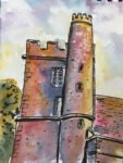
Hartlip Church Tower 2
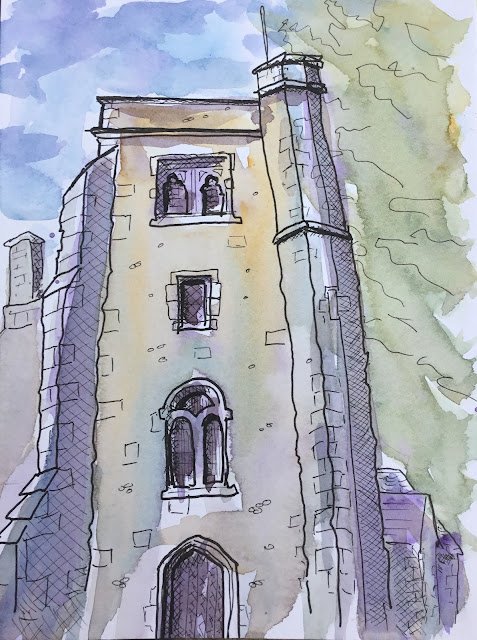
Tempting as it is to binge read my pile of new art instruction books, I do really need to test out some of my new art gear. First up are the fineliner pens, which means I’m dashing and splashing for the first time. As a gentle introduction to this new direction, I thought I’d head to Hartlip Church as it’s one of those subjects that it’s hard to go wrong with. I took my 5×7 inch hot pressed pad and my pens and didn’t know how many drawings I’d be doing. Being too tired after one drawing would be a fail. Two would probably meet expectations. I actually ended up with three drawings and could easily have done more: the sketches were completed more quickly than expected.
I started with a drawing of Hartlip Church tower. After putting down a very rough pencil outline as a guide, I used a thicker pen in the foreground and thinner pens in the background. I added a lot more detail than I would have done with any other medium and (I think) for the first time used crosshatching to shade in the darkest areas. I later marked in some really dark bits with the brush pen. And this all felt really easy and natural. Having eight pens of different thicknesses is a million miles away from having just the one pen.
I was pretty pleased with the pen drawing: it was pitched at exactly the level I wanted a dash and splash painting. Although maybe I need to think about how to draw in trees that are obscuring bits of buildings. And I have a birthday book that should help me with that.
When I got home, I got the iPad to choose my three colours for me and this is what it came up with:

I should probably explain how this colour selection works. The spreadsheet was asked to pick one of 22 colours, all with equal probability. It chose Prussian blue. Then, from the 22 colours I eliminated all the blues (Prusssian, cerulean, French ultramarine, indigo, Windsor (green shade) and Payne’s grey). This left 16 colours all given equal probabilities and the spreadsheet was asked to pick one. It picked yellow ochre, so I eliminated the all five yellows, and from the remaining 11 colours the spreadsheet picked out Winsor violet. The box where I’ve written in the subject doesn’t feed into any formulae but every time I enter in a different subject, a new set of colours is selected. This was all done in an app called Numbers – if it was in Excel I could have incorporated a randomise button instead. It’s also quite handy to have the subject filled in when I’m doing multiple paintings and I can take screenshots and keep track of which colours apply to each painting.
Anyway, about the colours. Not too bad a selection. A blue and a yellow, the yellow being fairly earthy. No red but the violet may well be OK.
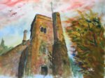
After drawing and dashing, on to splashing and I don’t think this is too bad at all for a first attempt. The sky is suitably messy, almost showing up individual brushmarks. The colours on the church are laid on quite loosely, roughly following shapes but without any effort to get the colouring in right. And that main wall facing us includes all three colours, running into each other: just the sort of thing that’s needed.
If I could change one thing, it would be that purple colour in the shadows. Maybe I could have mixed the purple with the ochre to get a more neutral colour?
Anyway, this worked out well. It’s going up for sale. To see the price, click here.

Leave a Reply