


Tempting as it is to binge read my pile of new art instruction books, I…
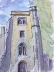
Hartlip Church Tower
It’s been twelve days since I last painted in watercolour. Just too many things going on at the moment, including the Euros. It’s not that these other things take up all the time – it’s that they distract me and I really need to immerse myself in my work if it’s to be any good.
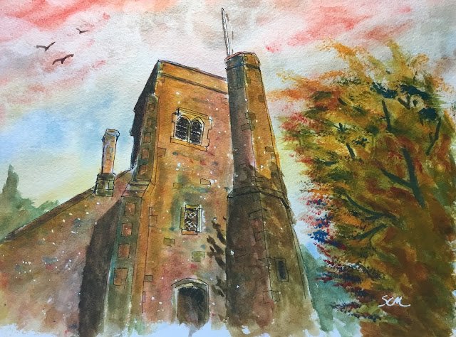
Anyway, I’m back into action. I went for a local scene. If I didn’t, everyone that voted in the survey would be wondering why they even bothered. This is based on a photo I took of the village church a while ago when I was out looking for painting ideas.
The plan for today was to draw the subject in rollerball in a reasonable amount of detail (so showing the odd brick here and there) and then to paint it in the multiple layered style that Hazel Lale talked about in the book I just read. For colours, I used rose dore, cerulean blue and Indian yellow, so this is in the key of orange cool. The cerulean was chosen for its granulating effects, the Indian yellow because I wanted things to look a bit sunny and the rose dore because it’s the red in my palette that’s most appropriate for stonework.
I even tried out some colour runs on scrap paper to check that the colours would work together. But somehow, in doing this, I didn’t spot how mixing all three together made a muddy brown rather than a sexy grey. Actually, I should even have expected the brown given how my blue was only semi transparent and my red and yellow were dual pigment colours.
So to prepare, I drew out the subject using black rollerball. The lines are all freehand but I admit I did start with pencil lines and a ruler. This is in three point perspective, with a vanishing point above the painting (making the tower narrow the higher you go) as well as the usual vanishing points on the horizon on the left and right. Then I did a little masking and spattered some masking fluid over the church.
I started with the sky. This wasn’t based on anything I’ve ever seen: I just put down the colours where I thought they looked good. It came out pretty well.
Then it was on to the church. In a number of separate glazes, I put on some yellows in the sunniest bits, yellows and blues in the greenest bits, reds and blues or both in the darkest bits, reds in the chimney. I painted some of the visible bricks in various colours and dotted in some random stones using all three primaries. Then I brought it all together by glazing over it all using a variegated mix of all three primaries, still making the mix yellower in the sunniest bits and redder or bluer in the darkest bits. I sprinkled over some salt at this point but it didn’t work today. I even put on some bits of water that I allowed to run down the church but they didn’t do anything either. I still wasn’t finished though, so even after all this, I added extra glazes over the sunniest and darkest bits using the relevant primaries.
Then it was onto the tree. Again I used all three colours. At the extremes of the branches, I stippled on undiluted paint using a specialised Terry Harrison foliage brush. The rest of the tree is just painted on as normal. The addition of little bits of visible branches was a definite improvement. At this point, I also added the background greens on both sides of the church. The green on the right was necessary to connect the tree to the church; the green on the left is there for balance.
Then finally I added the shadows and birds and rubbed off all the masking fluid. The shadows make this a very different painting.
It wasn’t until this was all finished that I realised it all seems to work. The multilayered colours are great and, yes, vibrant. There’s definitely some sun there too, in the yellows on the church and in the negative shapes around the shadows.
This was sold to a local churchgoer with all proceeds going to the church.

Leave a Reply