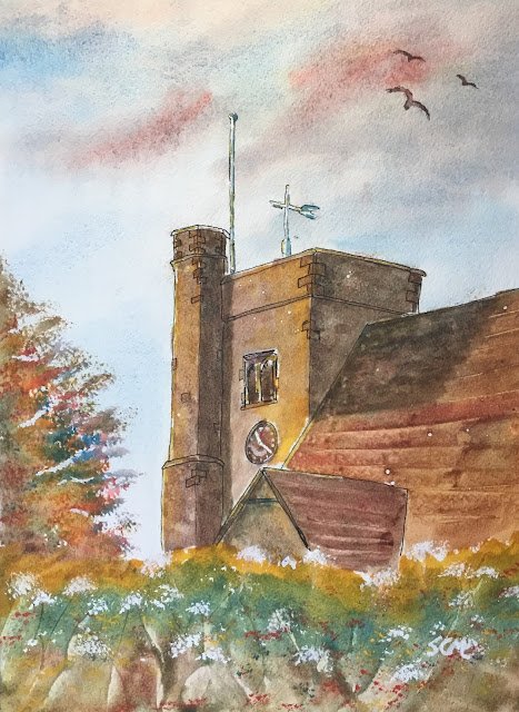
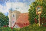
It’s the 29th of August already! The local church has another tea and cake afternoon on 12th September and I promised them I’d have another church painting for them to auction off. As it’s to be auctioned off, I thought I’d better paint it from a conventional angle and using a conventional colour scheme. So the angle is very similar to that of the oil pastel painting that was auctioned off last time, albeit in portrait format this time, without the village sign in the shot. The colour scheme is cerulean blue, Indian yellow and rose dore (the key of orange cool), which worked well for the church before. The blue granulates well and the yellow brings the sun with it. I should probably experiment at some point with quinacridone magenta as the red: this would be a triadic scheme (at least in my sense of the word, only very approximately in Stephen Quiller’s).
After putting a pencil outline down, I went over the church outlines (including some individual bricks) with a rollerball. This didn’t work out well yesterday with the figure drawing but I find it works for churches. Then I masked out the flagpole, the vane and some highlights and spattered a little bit of masking fluid on the church.
Next came the sky. This is mainly cerulean blue with a little bit of rose dore for some greys and reds. I did try a little bit of yellow in there but it didn’t work, so I removed it while I could. The cerulean in the sky graduated as well as I’ve ever seen it, so this was a great start.
Then onto painting the church. This was done in several glazes. The first was the darkest neutral I could manage, which I used to mark out shadows. Then some watery Indian yellow on the sunniest parts. And after that it was all neutrals. First a neutral neutral over all the grey bits (including those in shadow), then a reddy neutral over the roofs on the left. I tried to variegated the neutrals, making them redder in some places and bluer in others. Then I added a second coat of neutrals and scraped out some tile lines on the roofs with an old credit card and sprinkled some salt all over the church.
Next, the greenery. I should probably have started with the tree in the left but instead I started with the hedgerow at thee bottom. I started with bands of yellow, blue and red, trying to get them to blend into each other. They did in some places but in others they needed a bit of encouragement from tipping the paper around and even using a brush to mix them on the paper. Then I added some textures using a credit card – both thin grassy marks and mysterious scraped marks. Once this was all dry, I dabbed on some cadmium red, cadmium yellow and titanium white using the Terry Harrison tree/foliage brush. They came out really well, especially the white, which I’d dabbed at the top of the grassy marks to make cow parsley.
Only after this did I put in the tree on the left. For a while I’ve been using the Terry Harrison Merlin brush but today (as I say) I used the tree/foliage brush and it made a huge difference. I started by dabbing in the most extreme branches with the three individual primaries, then as I moved towards the middle of the tree, I started using mixtures of the primaries instead. And, because I’d done this tree after the hedgerow, I needed to add some more yellow at the bottom to blend into the hedgerow. Touch wood, you can’t see the join.
Then finally, I looked at the painting and decided to do a little tinkering:
– I created some extra gaps in the leaves on the tree by dotting in a little bit of titanium white (good)
– I added some neutral coloured birds in the sky (good) but tried to variegate them by dropping in a bit of cerulean blue and rose dore (bad)
– after not liking what the salt had done to the shadow on the roof I went over the shadows on the church again with another neutral glaze.on the roof, I applied this glaze as a series of parallel strokes (as opposed to a wash) to reinforce the pattern of the tiles. I liked the effect so much that I added another glaze of parallel strokes to the sunlit bits of the roofs
– I added a bit of colour to the flagpole and the vane (they needed it)
– I added a signature in titanium white (using a white gel pen would have been better)
And then I stopped.
I’m happy with this one: there are so many good things about it. The way the church has “caught the sun”, the colours on the the on the left, the textures and cow parsley in the hedgerow and the granulation in the sky. The roofs aren’t brilliant but they’re not the centre of interest so it’s ok for them to be as loosely painted as they are.
This one was auctioned off at a church tea and cakes afternoon, with all proceeds going to the church. It was bought by a couple of church committee members and they’re gifting it to a couple who are getting married in this church in a week or two’s time, which I think is a fantastic gesture.


Leave a Reply