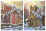
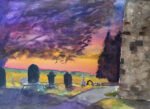
And here are those two paintings together. Number Two and Hartlip Church In The…

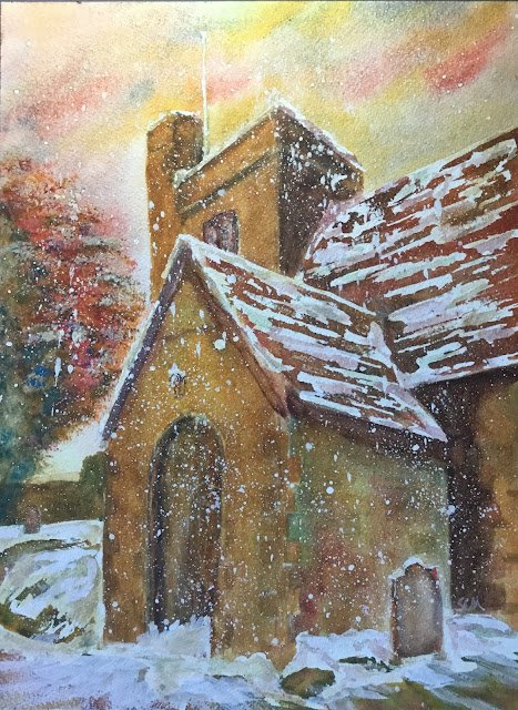
Hartlip Church In The Snow
A month or so ago, someone from the village church was asking about the possibility of me painting something they could use for the church’s Christmas card. So today I’ve been busy with this wintry painting and trying out some of the ideas from that Nita Engle book.
The primaries today were cerulean blue, rose dore and both raw sienna and Indian yellow. With two yellows in the palette, this painting is in a mixture of two keys: orange cool in the warm places and green warm in the cool places. These are colours that work really well for the church and that also did a great job on The Rose And Crown In The Snow. Titanium white also made an appearance.
After finding a suitable reference photo (from the middle of summer with no snow) I pencilled in the picture. Then I painted masking fluid over all the places I wanted there to be snow and over the flagpole. And for good measure I also spattered some fluid everywhere for falling snow.
And today I started with an underpainting. I used all four primaries, trying to have more red on the roofs, blue and red in the shadows and yellow around the lantern and Indian yellow in a few spots in the doorway and around top of the church where I wanted some welcoming warmth. In the underpainting, I just assumed the sky would remain untouched afterwards, which it was.
Then I added several layers of glazes to the church and foreground, variegating colours, keeping shadows dark, trying to make the door welcoming, trying to distinguish the different coloured bricks in places. I was tempted by the salt, so added one final thin glaze of raw sienna and threw the salt on but it wasn’t performing today.
When I was happy with the church, I moved on to the tree, dabbing in all four primaries separately with the Terry Harrrison brush and foliage brush and blending them together with a bit of water around the middle of the tree.
And then I got to the interesting bit: the removal of the masking fluid. As expected the snow in the resulting painting was too white. So I mixed up some watery neutral colours to paint over the snow in places and to try to make the snow three dimensional. I used more blue and red in the neutral in shadowy areas and more yellow in it in sunny areas. Things still weren’t quite right though – it still looked like raw white paper with a bit of watery neutral colour on it. So I reached for the titanium white. I used it quite dry, adding it in places to the existing snow (on top of both the whites and the neutrals) and used it in quite textured strokes to drag existing piles of snow over the grass and footpath. It felt like dragging the snow around with a shovel, which is a good thing. I also spattered a lot of titanium white over the painting to turn the gentle snow shower into something more like a blizzard. And I dabbed some snow onto the tree branches using the tree and foliage brush.
I really like the end result. The dragging around of the snow with the titanium white at the end made a big difference, as did the titanium white spatters. And the underpainting definitely made things look lighter above the doorway.
I gave this one to my churchgoing neighbour Barbara as an 80th birthday present, which counts as a sale. The local church told me that they’ve not been given permission from the local group of churches to use this on Christmas cards. Probably something to do with how all this group of churches always use the same pictures as each other on cards every year.


Leave a Reply