


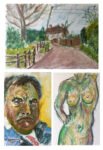
I learned a lesson from my first time using watercolours, markers and inktense pencils. And…
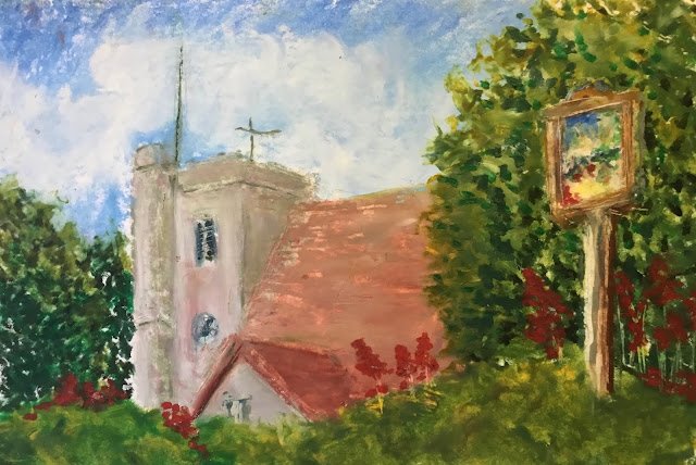
Hartlip Church In Oil Pastel
More practice drawing with the oil pastels today. As I’ve got landscape colours, I thought I’d better have a go at a landscape, this time using Scrooge The Profit’s rule of three on all my colours rather than letting some just stand on their own.
And you know what? I’m getting better at these. I like those colours in the wall of the church – the oil pastels seem to positively encourage impressionistic colours, which is absolutely fine by me. And those trees on the left and right! I’d have struggled doing trees like this in watercolour but they’re so simple to do in oil pastel! The greenage along the bottom isn’t as good though – maybe I should only use finger smears for people and man made structures and leave trees and hedges dabby. The worst bit about this one, though, is the main church roof. It needed a bit more colour variety and maybe could have been a bit darker to contrast less against the smaller roof.
So I like the impressionistic colours and decent trees that I get from pastels. Another thing I’m liking is that I don’t need to get a pencil drawing down first. I can do a rough outline in pastel and then paint over it, correcting myself later if something’s not right. Just like people on Portrait Artist Of The Year. I never used to be able to understand how they could just lay down an outline in paint at the beginning. But I do understand now.
This one was auctioned off at a Hartlip Church tea and cake afternoon, fetching a good price and with all the proceeds donated to the church. The first time one of my paintings has been auctioned. Maybe next time I’ll step outside while the auction is going on though, avoid the tension.

Leave a Reply