


I thought I'd have a go at painting Brian Clough today. It was always going…
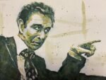
Grigori Yefimovich Rasputin
There was a certain man in Russia long ago. He was big, he was strong, in his eyes a flaming glow. Most people looked at him with terror and with fear but to Moscow chicks he was such a lovely dear.
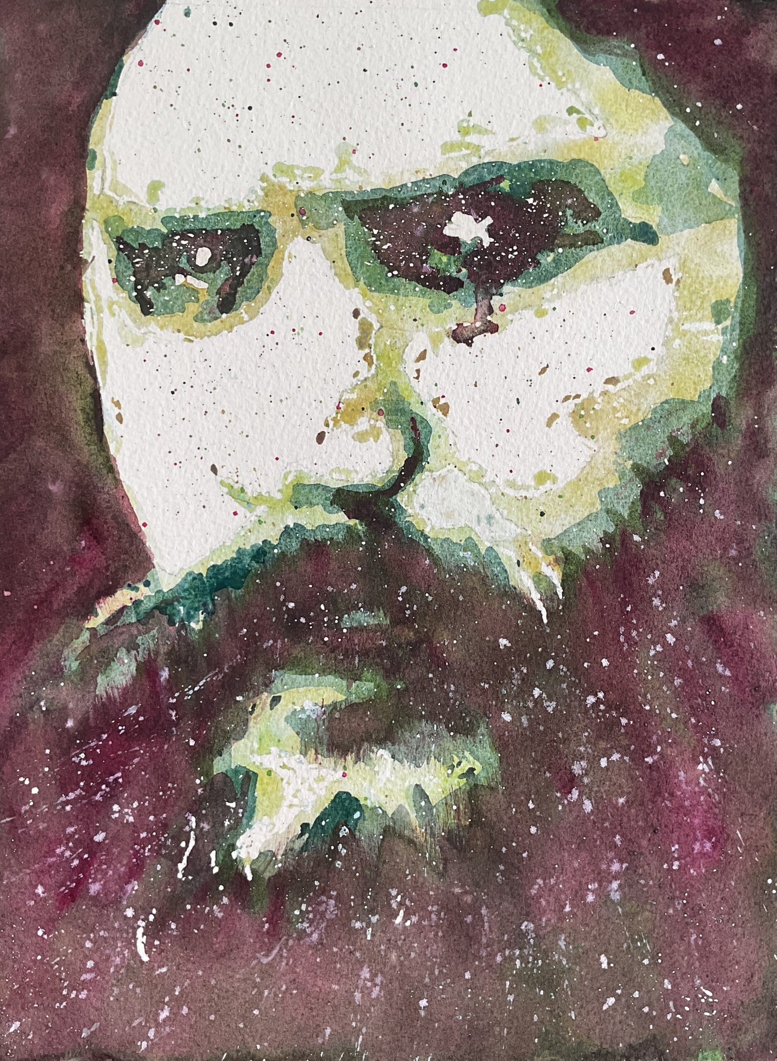
It’s my first day painting for a week. Not only that but I was up late this morning, have been for my walk and was looking forward to the and cake at the church in the middle of the afternoon so it was always going to be a stop start day without as much time to spend on a painting as normal. Only a year ago, this would push me into attempting an Inktense figure or maybe a made up landscape. But based on recent experience I know that posterised portraits don’t take too long. After painting The Earps last week, I’ve been thinking about painting more historical figures, particular those that everyone has heard of, has maybe seen on TV or in films and has a picture of in their head. Rasputin was one of the first names that came to mind. I deliberately cropped my source down to a close up photo, like I did with Ally MacLeod, because I wanted the viewer to be drawn into those eyes.
I’ve gone for the Shire colours, supplemented as usual by forest brown and green apatite genuine for the dark values but quinacridone magenta and white gouache also made appearances at the end. I created a posterised look using the Notanizer app. Then I started with a variegated layer of Shire yellow, green and olive in the light, middle and dark areas. Then the same with Shire blue and grey in the middle and dark areas and two extra colours in the dark areas.
The plan was for me to do nothing else but I wasn’t happy with what I’d achieved. Maybe that second layer (the Shire blue and grey) had been applied a bit too thickly. Because my third layer was barely distinguishable from the second. So to darken the final layer, I introduced quinacridone magenta, red being green’s complementary colour. It certainly managed to distinguish the second layer from the third. I also used the Merlin brush to make the facial hair edges look hairier.
As a first finishing touch, I spattered over lots of the different colours plus titanium white. With the white I tried to do directional spatters following the hairs in his beard. And I thought that was me done. I wandered over to the local church for tea and cakes. First Sunday of the month and all that.
When I got back, I removed all the masking fluid from the painting and was a bit underwhelmed. Things just didn’t right in a couple of places on the left of the painting. We’re not just talking about the likeness not being right – this was more serious stuff. I ended up putting on more Shire blue along the top of his tache, then adding a glaze of quinacridone magenta and green apatite genuine all over the big shape in the top left to narrow the width of his head. This, unfortunately, meant me going over some spatters and white spits but needs must. And that was me done.
And, you know what? I don’t like this one. It feels rushed and lazy. I should have exercised more control over values as three different greens would have looked better than having this purpley brown top layer. There’s been a compositional misjudgement in there too, with too much white area showing: I should have slid the Notanizer controls a bit more to the right on the scale. I’ve ended up with something that looks like someone with a stuck on moustache. I like the spatters, though, and some of the explosive looking directional marks in the beard. Oh, and the way the paint ran down from his left eye adds a certain something.
And, while I don’t personally like this one, others apparently do, so I’m putting it up for sale. To see the price, click here.
Leave a Reply