


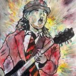
Oh dear, this hasn’t been a great start to September. I wanted to give the…
Gravitational Waves
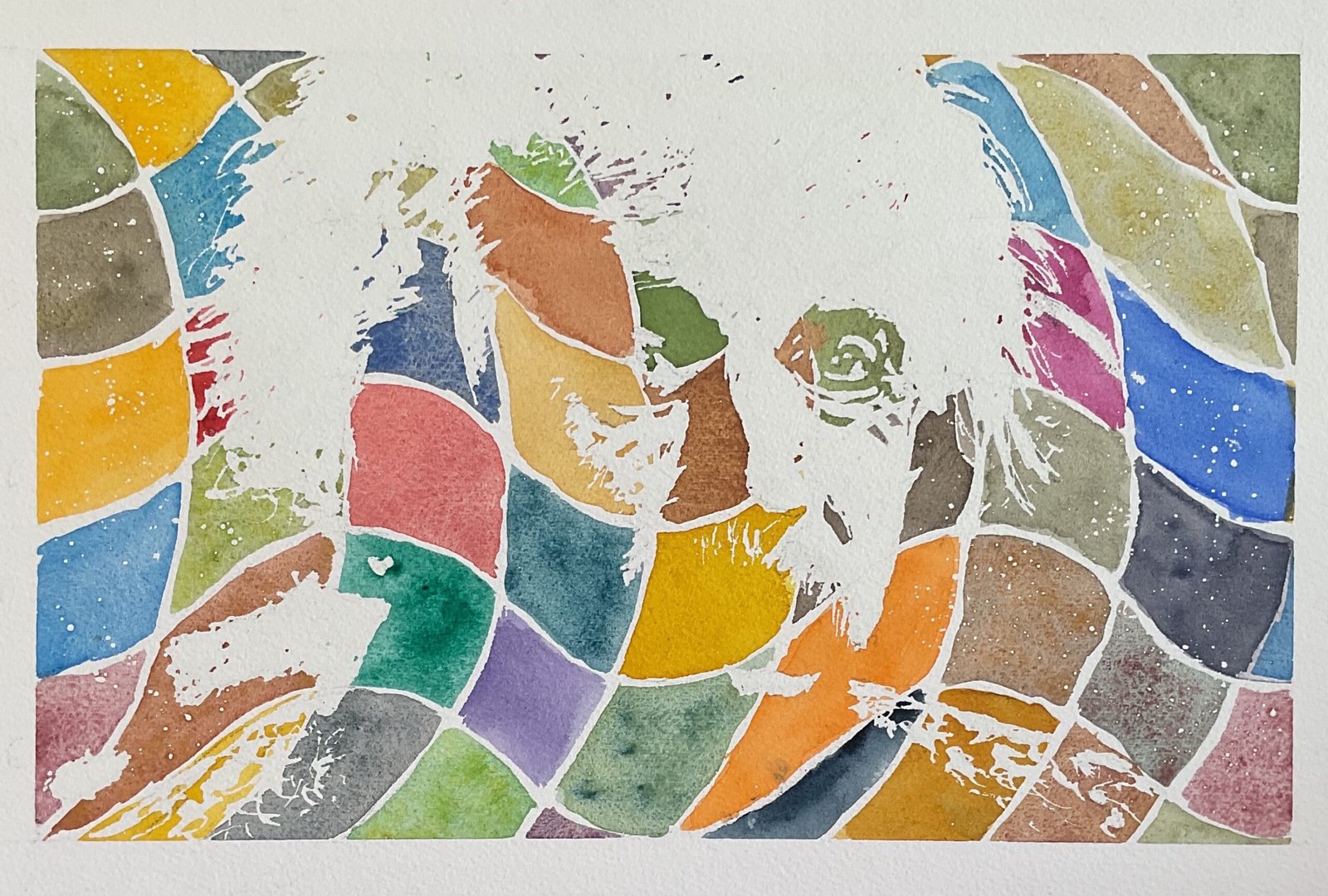
I’ve done a few patchwork portraits in the past. These are where I come up with a two value plan for a portrait, mask out the whites and then paint over everything else, not as one shape but as a patchwork of squares, each in a different colour. I wanted to do something similar today but to push some boundaries, so I replaced the horizontal and vertical lines dividing up my patchwork with wavy lines. This all felt like the warping of spacetime, so Albert Einstein was the obvious subject.
With these patchwork portraits, I like to have a value plan with as little white in it as possible and it took me a while to find a portrait of Einstein that worked but I got there eventually. I was a little worried about the lack of a mouth or any highlights on the bottom left of the face (from the viewers’ pov) but we happy taking a risk.
I currently have 41 colours in my palette, so went for 40 colours in a 5×8 grid. I’ve left out the MGraham burnt umber as it has one pigmentation common with my Winsor & Newton burnt umber. I was left with two cerulean blues but they use completely different pigments, so I was fine with that. I threw all 40 tubes on the desk, divided them into five groups of eight (reds, yellows, greens, blues, neutrals) and then into a grid of 40 that I thought would work
With a 5×8 grid planned, I set the portrait out in a 5×8 rectangle, meaning that when it’s framed, there will be bigger white bands showing at the top than at the bottom. Colours that are pushed out by waves on one side of the painting get compensation in the form of a second tile on the opposite side of the painting. The next time I do a painting like this, I might try 40 colours in a 6×9 grid with all colours getting a single, whole tile and with empty white areas around the edges where there are incomplete tiles. If that doesn’t make sense, just wait and see what I come up with. Oh, and I masked out the edges of my rectangular painting area with tape.
I wish I could say that it was an easy process painting this one after I’d put down the making fluid and let it dry. I knew it would be easy to make mistakes with a warped grid, so I grew a grid of squares in some scrap watercolour paper, labelled all the tiles with colour names and all the rows and columns with letters and numbers. I started in the middle, where I didn’t need to worry about colours being pushed off the edge. And I still screwed up. My very first colour went down in the wrong tile. So I relabelled the rows on my plan and carried on more carefully, not making my more mistakes. I knew that some colours would get less exposure than others, being unfortunate enough to be allocated a tile with a lot of white highlights. But what took me by surprise was that the tiles weren’t all of equal area: the azo orange area is huge. I should have been able to work out before starting that this would happen. It doesn’t spoil the painting though.
The assessment of the final painting was always going to depend largely on whether the underlying value portrait gave a good likeness and I’m glad to say this this one works. The eyes, the hair and the hint of a ‘tache are enough, even with there being no information to the viewer in the bottom left of the face. And, as well as the likeness and all round craziness, there are some interesting relationships between the face and the waves in places to create an extra bit of interest. This one has to go down as a huge success. It’s up for sale, with the price to be found here.

Leave a Reply