


I thought it was about time I did something more conventional. Nothing abstract, no acrylic…
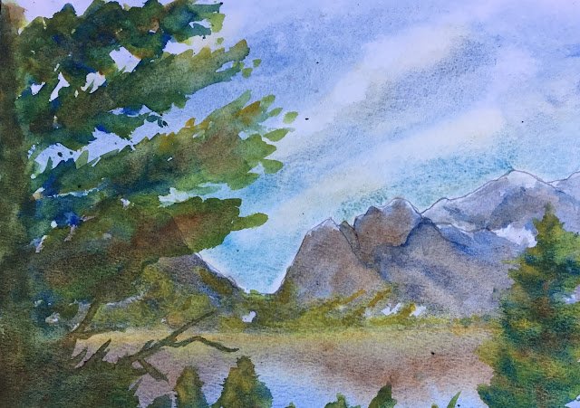
Grand Teton National Park
I thought I should go back to basics and paint a normal looking landscape as these were popular on Facebook last year. This one is based on a view of some mountains in Grand Teton National Park. I found that out by googling the photo I started from. I can’t remember where the photo came from: it could well have been a friend’s holiday photo.
Most of the colour here is French ultramarine, transparent yellow, raw sienna and burnt umber. But there are two extra colours that I’ve put in following hints in a Paul Talbot-Greaves book on painting landscapes. One is cerulean blue, used in the bottom half of the sky (and granulating quite nicely, I have to say). The other is the use of cadmium yellow to add highlights in places where the transparent yellow just isn’t yellow enough. No quinacridone magenta, which means I’ll be doing a second painting today to get my purple fix.
I guess I’m happy with this. The values (ie how thick or thin the paint is) have worked out well for once. The colours are generally good. And I’m still looking like favourite for Sky Mountain Artist Of The Year when that becomes a thing. On the other hand, there’s something a little flat about the painting. I’m not sure exactly what it is. And the branches on the tree in the foreground on the left are evenly spaced, making it look like that artificial Christmas tree that comes down from the attic each year.
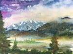
This one has been cut up to be used as collage material.
Leave a Reply