I wasn’t very good at painting and not that committed to improving. I would have…

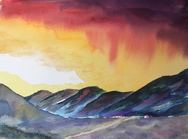
Glean a’Chroin
I felt inspired by one of the subpaintings in my last post (The Joy Of Six). It was the one in the bottom right. Winsor Orange and Indigo are like a match made in heaven when placed next to each other. And a Winsor Orange sky with some reds and violets cropped in looks good, especially if a big triangle is left white on the left. So I thought I’d take the lessons from that one and turn them into something bigger.
This wasn’t painted in any particular colour key, instead using lots of different colours from my 24-pan experimental palette.
The first thing I did was to search around for a suitable skyline that I could silhouette in indigo. I found this glen up in Scotland (you wouldn’t recognise the photo after I used these colours). As I sketched in the outline, I found my plans changing. Rather than just sketching a skyline and silhouetting the whole thing in indigo, I found myself looking at the shadow shapes on the hills and thinking about only using indigo in the shadows. And so it all changed.
After masking out the buildings, I put in the sky. I started with a big triangle of Winsor orange, leaving white on the left. I then charged in some Winsor violet, permanent alizarin crimson and permanent rose and tilted the paper up to let the colours run. I was happy to let some of the orange bleed into the hilltops to help unify the painting (like Charles Reid told me to do with flesh tones). Just for the hell of it, I added some transparent yellow on the left behind the hills and dry brushed a bit on the top border of the white expanse. I ended up with less white than I’d intended but maybe this was for the best.
Then on to the hills. I started with some indigo in the shadows I’d marked and in some random other places. After letting it dry, I glazed over Winsor blue (green shade) and Prussian blue in different places. The tops of the hills, where the orange overlapped, were looking a bit green, so I dabbed in those two reds to neutralise the colour a bit. And then, because this went so well, went a bit crazy, dabbing in more reds, some Winsor violet and some raw sienna and yellow ochre. I think some burnt sienna might have gone on too.
The foreground went pretty much the same way except that I used French ultramarine rather than the two cool blues. There was a bit more burnt sienna this time, especially in the hill on the left and lots of the reds, earthy yellows and violet everywhere.
For finishing touches, I removed the masking fluid and added roofs in permanent alizarin crimson, then added some grassy bits in Winsor orange and indigo using the Terry Harrison merlin brush. Those two colours are just as amazing mixed as they are in pure form adjacent to each other.
Standing back from this one, wow. My best painting this year by far. This feels like the start of a new era in my painting. After spending over a year doing paintings that were largely based around only three primaries, I might take a break from that and do more of these multicoloured paintings and start to make a dent in those halfpans in the experimental palette.
A year and a bit later, when one of my other paintings was a prize in a local church raffle, there was a primary school age lad who was really disappointed to not win it after spending all his pocket money on tickets. So I met up with him and he took a good look through everything I had up for sale and told me this was his favourite. So it’s his now, free of charge. Don’t all expect this.


Leave a Reply