


I discovered something new today, thanks to Liron Yankonsky's YouTube channel. It's the Artist Assist…
Glazed Balls
My year end painting hiatus is still on but swatching doesn’t count as painting in my book and there’s an experiment that I’ve been meaning to try out for a few days.
Since discovering the Artist Assist App and using it successfully, I’ve been meaning to give it more action. But rather than using the same three colours every time, I want to give other colours a go. It might be interesting to do two or three portraits of the same subject (maybe all from the same source photo, so with the same underlying value plans) using different colour schemes. If I can manage to do three portraits in parallel and finish in under four hours, this might even be worth trying if I make it onto Portrait Artist Of The Year.
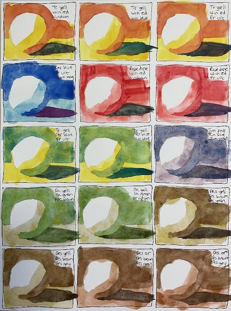
But to be able to do this, I need to have a portfolio of triads ready to use in triple glazed portraits. And that’s where today’s experiment comes in. I identified fifteen candidate triads after restricting my colours to transparent or semi transparent (even in the first layer) and restricting my first and second and layer colours to strainers so that they wouldn’t be disturbed by later layers. For source material I picked a photo of a ball on a table that the app reduced to really simple value shapes. And then I painted the ball using each of my fifteen candidate sets. Here’s how I got on.
In the first row, I tried transparent yellow as my first layer, followed by Winsor red. Then for the final layer I tried, from left to right, viridian, Winsor blue (green shade) and French ultramarine. I already know that the French ultramarine works from the Tracey portrait and it looks OK here. As an alternative blue, the Winsor looks OK and shows up some interesting green/orange complementary clashes as an alternative to the darkest areas coming out quite neutral looking with the French ultramarine. The viridian gave me praoblems and looks ugly here after I got the initial consistency wrong and had to lift some paint out and start again. I think I’ll pass on the viridian but the other two look OK, both very summery.
Then we have a cool looking combination of cerulean blue, then French ultramarine, then quinacridone magenta to give purple shadows. The purple stands out a bit against the blue; maybe this would look better were the darker values more scattered over the painting.
Then we have two warm combinations, starting with rose dore and then Winsor red. For the final layer I tried viridian and French ultramarine. The French ultramarine combination looks OK but I had problems with viridian again. But, putting aside the problems I caused myself by lifting out paint, it seems that viridian results in too muddy a colour over those two reds, so it’s getting rejected.
The last two from my main palette of colours are green looking combinations, made up of transparent yellow, then very lean blue, then a darker blue, French ultramarine or Winsor blue green shade. Both look good, and cerulean on top of transparent yellow is amazing, but I slightly prefer the French ultramarine with its reddish hints resulting in a more neutral looking shadow colour. Both are fine though.
After that we’re onto supergranulators, starting with the tundras. I didn’t fancy using tundra orange or tundra green, so that left just tundra pink followed by tundra blue followed by tundra violet. And it’s a great combination. The granulation effects are even coming through on what’s hot pressed paper – a smooth surface that I picked out today so that I could write on it with fineliners.
Next up are the Shire supergranulators. With Shire blue being opaque and Shire olive and Shire green being quite similar, I went for Shire yellow and Shire green as the first two layers, then tried out Forest brown and green apatite genuine as third colours. I guess I could have tried out Shire grey as third colour, but these two dark greens seemed to form a more natural sequence with the first two layers. The two trios are similar looking and both acceptable. I might vaguely prefer the set with forest brown as the bittiness of the green apatite genuine seems a bit out of place.
And finally it’s the desert supergranulators. With desert orange and desert yellow both being worthy starting colours, desert grey and desert green worthy darks and desert brown the only mid-value candidate, I had four candidate combinations to try. Looking at the results, I prefer the grey to the green as the shadow colour as it works better as the third in a sequence – the greens and reds in the forest brown look a little out of place. For the first colour, though, I’m on the fence. Desert yellow looks good for a subject in the sun, desert orange looks good for one in the shade on a sunny day.
So I think I’ll be keeping a list of these ten for when it comes to some Andy Warhol portrait action:


Leave a Reply