And finally here's the last portrait in the collection, Captain George Mainwaring, played by Arthur…

George Orwell
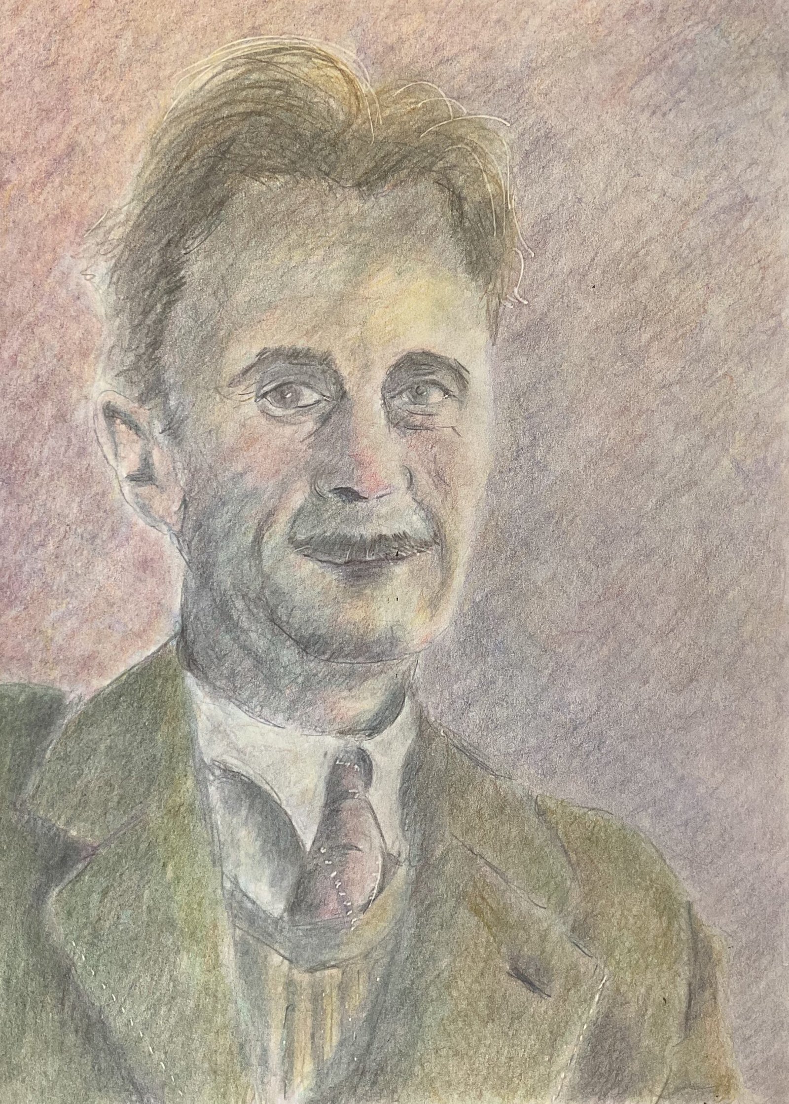
The painting’s slowed down this week as our dog‘s had a big health scare and isn’t yet back to normal. So I’ve been keeping her company a lot of the time indoors and unable to get out to the studio. But yesterday I decided enough was enough and that I needed to get the artistic juices flowing. So I brought the coloured pencils indoors: they’re a medium that I can use in the house without making a mess. I picked a photo of George Orwell as subject matter, someone that came into my mind while I was reading 1Q84 by Murakami.
I created a three value plan in the Notanizer app and used a grid to help me pencil in all the main outlines and the dark shapes. Then I started, as I normally do, by shading in the darks with four really thin layers of colour: delft blue, helio blue reddish, dark red and dark pthalo green. They create a good black.
After that, I put on loads of thin layers of colour. Sometimes I reinforced by darks with those same four colours, sometimes with darks like indigo, black and sepia. Sometimes I used flesh tones in the face, sometimes yellow at the top, green and blue at the bottom and red in the middle. Sometimes I used clothing colours on the flesh for a bit of reflected light. Sometimes I referred to the value plan, sometimes to the original photo. I went through several different variations of jacket colour. And I used a lot of different layers of colour in the background, sometimes just one colour, sometimes one on the left and one on the right, sometimes one at the top and one at the bottom, sometimes one to the right of the face like a shadow and a different one everywhere else.
And I just kept going and going. I did some work in the evening and then more this morning. Not being in any great hurry, I managed to make my layers thinner than usual, so was able to put on more of them without filling up the tooth of the paper. I was well and truly in the zone but eventually I decided that I had something that would be hard to improve on, so I stopped and blended all the colours with a paper stump. Paper stump blending works out better for me than burnishing or using blending fluid. And that was me done.
This one worked out well. It’s up for sale, with the price to be found here. The best thing about this one is the richness of the colours, only possible because I laid the pigments on so thinly, enabling me to put down a lot of layers without filling the tooth of the paper. There are some thin outline lines visible, particularly in the eyes, mouth and ears but I think these are fine. ChatGPT keeps telling me I have too little variety in my edges but today I have a range of hard and soft edges which has to be good, surely?


Leave a Reply