


Right, enough messing about. I really should be doing more watercolour painting. I had an…

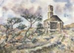
Garrow Farm, Bodmin Moor
So here’s the painting I’ve been busy with over the last couple of days. It’s a deserted farmhouse on a Bodmin Moor, a scene that’s been in my source material pile for a while. I originally picked it out as a potential subject for a painting with the desert supergranulators and it’s possible that I may come back to this scene in future.
I started by putting down a very light pencil drawing. Because exact replication of the scene wasn’t that important, most of the drawing was freehand, although I did use come ruler measurements to get the building right; one of the advantages of using a photo on the iPad rather than a printout is that I can scale the size of the photo on the iPad to match the size on the paper. Once the pencil outlines were down, I put down some marks with fineliners. Most of these were the shadowy gaps between the foreground rocks, although I did add some shadows under other rocks, under the edge of the roof and in the doors and windows. I also drew in the trees, added spotty textures on the hillside and outlined the odd brick. I managed to resist the temptation to outline the house or the hills: a sure fire way to turn my starting drawing into a page in a colouring book. Oh, and I also marked out a few ruts in the paper for grasses and roof tiles.
And then I moved on to the colours. For the initial colours, I used:
– blues for the sky between the clouds, with some purples and greys at the bottom of the clouds
– all sorts of colours for the rocks at the front and, to a lesser extent, those further back
– otherwise (so for the house, the walls and all the empty land), following an idea in the Arlene Steinberg book, I started with the complement of the local colour. So violet for the orange hills, red for the grass and I can’t remember what for the house. And at that point I took an overnight break.
This morning I returned to the painting and continued to add colour, keeping the pressure of the pencil on the paper as light as possible. I tried to add as many unorthodox, impressionistic colours as possible while I was still able to apply the colour lightly. Local colour could wait until I was needing to apply more pressure. The sky was maybe an exception, with only blues, reds, purples and greys applied. There were no yellows or greens in there. It was while colouring the sky that I really got into a groove. I was playing a Widespread Panic album (Light Fuse Get Away) and the long, creatively meandering guitar solos crept into my work, when adding one colour to the sky I’d wander around all over the place, hanging around in one spot for a while but then heading off somewhere else without taking the pencil off the paper. Every now and then I’d swap the pencil for another colour. I soon found myself doing something similar over the hillside. Painting to music is one of those side benefits to building the studio and it’s not just making it more fun to paint, it’s also improving the quality of my work. I can’t wait to using combining coloured pencils with the Grateful Dead in the background. And whenever I picked up a colour that I thought might do the trick, I marked out a couple of bricks in the building.
At some point I got to a place where I couldn’t add any more low pressure colour, so started having to apply more pressure when adding colour. This is the point at which I switched from crazy impressionistic colours to sensible, local colours. So more oranges and browns on the hillside and more greens in the foreground.
And, before long, I found myself needing to think about finishing the painting off by smoothing the colour out or (more often) by burnishing. First, though, I added in the greenery of the trees as I’d reached the appropriate pressure level. You can see I’ve used loads of different greens and some bright yellow highlighting but there’s also some burnt sienna in there for earthiness. And then it was time for burnishing. I used white in the sky, and on the building and the rocks. For the foreground and the field t9 the right of the house I used three different greens. And what else? Terracotta in the background amd middle ground and I think it was a light warm grey in the stone walls.
Finishing touches? Well, to get a smooth transition from hills to middleground to walled off field to foreground, I added a bit more terracotta to the walled off field and a bit more green to the middleground. And because some of the shadows between foreground rocks were looking a bit too stark, I added some Payne’s grey around the cracks (obviously firm pressure at this stage). And that was me done.
And was it a success? Oh yes. There’s so much to like about this one. Just take a step back and look at it. The colours in the sky, the colours in the hills, the colours in the house, all of them unsaturated (ie neutral rather than in your face) but all including so many impressionistic subtleties. And then there are the colours in the rocks at the front where I’ve not held back and the contrast is evident. The greens in the trees also contrast against the background, in this case in a green/orange complementary way. Yes, this one’s going up for sale.

Leave a Reply