


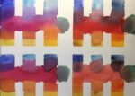
It's that time of year when my mind turns to selecting a squad of colours…
From All Of These Signs Saying “Sorry But We’re Closed”
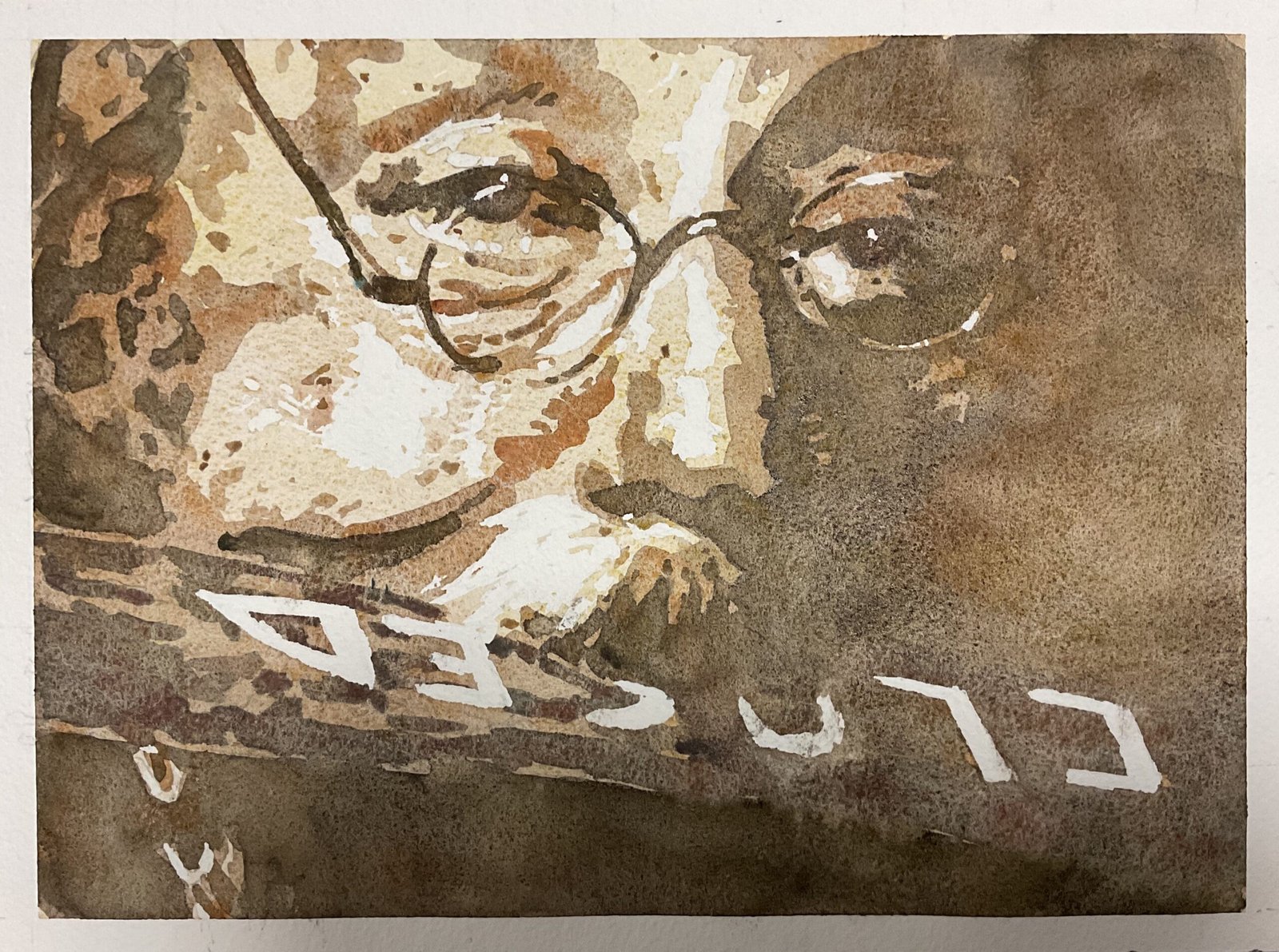
The Good, The Bad And The Ugly was on the telly the other day. It’s one long gallery of painting ideas but the shot that sprang out at me this time round was one of the gun shop owner played by Enzo Petito being made to stand there with a closed sign in his mouth after being robbed. An iconic shot. I found the scene on YouTube and deliberately paused at the point where he tilted his head to one side with an expression that didn’t express anger, fear or humiliation, just a look saying “Yeah, fair play, you got me”, the look that people give when being beten at chess or eliminated from The Traitors. A look that demanded to be painted.
This is a posterised painting using the desert colour scheme. I roughly followed my usual process:
- I used the Notanizer app to come up with a four value plan
- I used a grid to mark the borders of the highlights and darkest areas. I marked the highlights in faintly but the darks more firmly as they needed to be visible under the first two layers. I left a margin around the outside today because I didn’t wanted to minimise any cropping when the painting was framed: the image in the film is already tightly cropped
- I masked out the highlights
- Then painted over all the lights, mid tones and darks with desert yellow and desert orange
- Once dry, I painted over the mid tones and darks with desert brown, I’d not drawn in the borders between mid tones and lights, so this was freehand with the Notanizer image and the darks and highlights marked on the paper as guides
- Then I painted desert green and desert grey over the darks. I used the green over the sign and the grey everywhere else in an attempt to distinguish the sign from the background. It’s very subtle but I think it just about worked.
- And after removing all the masking fluid, that was me done.
This one works for me. I could tell when I looked at my initial pencil marks that it would. The colours, the values, the granulation, the look in the eyes, they all come together just fine. Should I have left out those weird details in the bottom left? Maybe. Or maybe they’re needed to balance the painting. I expect I’ll get comments about how this looks like Dave Lee Travis but I don’t care. I like this one. It’s up for sale, with the price to be found here.
And it ticks off another line from Telegraph Road, not something I thought about until finishing it but an unexpected bonus.
Leave a Reply