


It's a bank holiday, the sun's out and I'm back on the watercolours for the…
Free Horse Manure
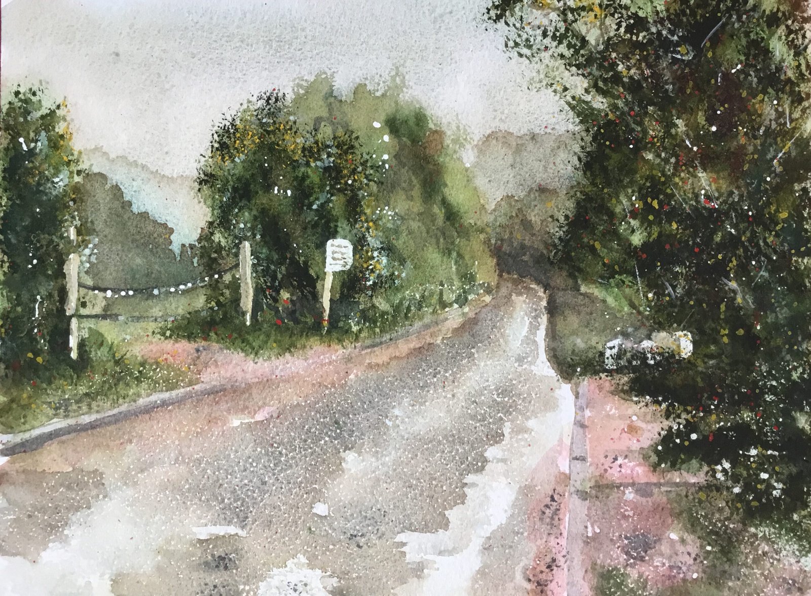
I took my phone out with me today on my daily four mile walk through Queendown Warren, hoping to find some good subject matter after feeling a jot short of ideas yesterday. A lot of rain came down during the walk but I was quite happily waterproofed. This the view on the walk that begged most to be painted. There are lots of views that would be amazing outside my window but which make for pretty boring paintings. This is a boring view that makes for an interesting painting. There’s the path into the painting, the reflections on the road, the drips of water on the chain between the posts and the contrast of the white sign against the dark trees behind it. The sign says Free Horse Manure, hence the title of the painting.
I’d already decided to do a painting using the Shire supergranulators. I supplemented these, as is my now normal custom, with two more greens: forest brown and green apatite genuine. To keep the greens well out of Haribo territory, I mixed all of them with burnt umber. Later on I used rose dore to add some reddish tones and cadmium red, cadmium yellow and titanium white as garnishes. So that’s a whopping eleven colours in all but this still feels like a limited palette collection.
I didn’t use a grid for my drawing today, although I did check the positioning of a few points using a ruler. I masked out the sign, a couple of posts and some bags of (presumably) horse manure, spattered on some masking fluid where I thought I could use some white spots and rubbed a candle over the road and foreground for texture.
My underpainting was better today. I started with Shire grey, Shire blue and burnt umber in the sky them moved on to various greys and greens elsewhere without worrying about the edges between shapes. I dropped in drips of water and charged in bits of paint in an attempt to draw out textures.
And then I worked from front to back. The furthest trees, which don’t exist in reality, had emerged in the underpainting and I left them as they were. For the next closest trees (the furthest in reality) I used Shire blue, the coolest of the greens, along with a bit of forest brown for variety. For the next closest I used green apatite genuine. After that the plan was to use warmer greens: Shire olive, Shire green and Shire yellow but this was where I started to run into trouble. Because these greens are a bit too pale and weak to be able to compete against the green apatite genuine behind them.
To get around the problem, I lifted out as much of the middle distance green apatite genuine as I could, leaving it quite pale so that I could use a stronger green apatite genuine for the closer trees. So those closer tees are from green apatite genuine stabbed in with the Merlin brush. Even after making the middle distance trees paler, I found I needed to stab a little bit of cadmium yellow into those closer trees to help them stand out.
For the road, verges, sign and posts I just painted in whichever colours I could see in the source photo. As I said earlier, I brought in rose dore to get some red tones, mainly in the concrete in the bottom right.
For finishing touches I stabbed a little bit of white into some trees, added some white highlights, spattered on cadmium red and cadmium yellow and then used burnt umber, titanium white and my two cadmiums to paint in lots of brambly branch lines in the tree on the right, that hadn’t been looking great. And that was me done.
Before I get to the scores on the doors, I think it’s worth me recording here the biggest lesson of the day, and it’s this. My Shire supergranulating palette, including its two guest greens can be divided into two sets of greens. Forest green, green apatite genuine and Shire blue are all greens that work best in trees. Shire green, Shire olive and Shire yellow, the greens that I was finding too weak and watery for trees, work best in grassy meadows. I think I already knew this but it really hit home today. It’s something I won’t forget next time.
From a distance this one’s quite evocative of the view and of the feeling on the day. I also like the rose dore and how it contrasts against the complementary greens. It’s not my favourite painting ever, probably because I prefer more saturated colours, but it sold really quickly to a certain local stable owner and horse manure entrepreneur.
Leave a Reply