


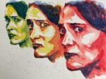
A lot of my recent watercolour portraits seem to have been painted from a distance,…
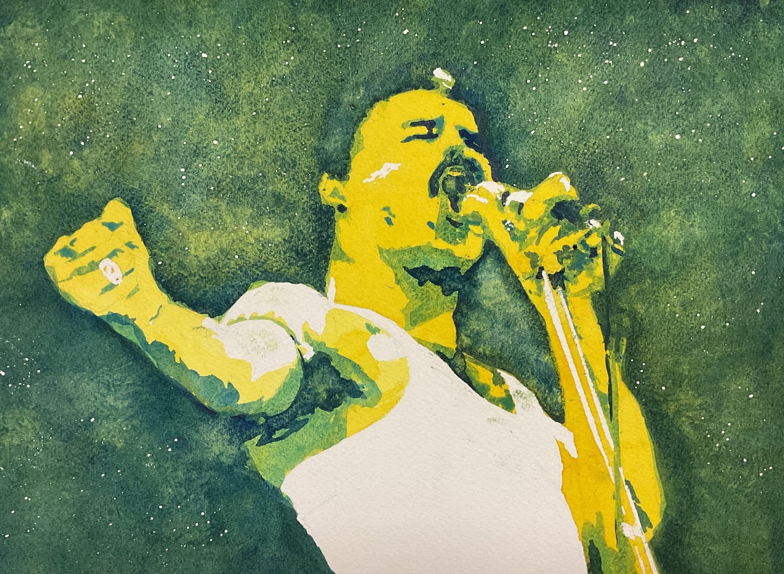
Freddie Mercury
Right. That’s enough of the Inktense pencils. I need to get back to watercolour portraits to impress any passing Portrait Of The Year Judges. I thought I’d have a crack at Freddie Mercury today – he’s been waiting patiently for a while now. Colour-wise, having used my red triad for Amy Winehouse, my amber triad for Jimi Hendrix and my blue triad for Warren Haynes, I thought my green triad deserved the chance of a full size portrait. So this one has transparent yellow as a first layer, cerulean blue as a second and French ultramarine as a third.
At the beginning when I was reserving the whites with masking fluid, I also spattered over some masking fluid for a starry background. Later on, with both of the blue layers, I tried to stimulate some granulation by charging dry colour into areas that were already wet. And I did a little bit of dabbing with kitchen paper on the final layer to create even more texture. There was a bit of fiddling at the end, painting in some second or third layer shapes that I’d missed and tinkering around looking for a likeness. In particular I tried to bring out Freddie’s hair with some very dry French ultramarine rather than just leaving it to merge with the background. And that was me done.
While I remember, grids are great for getting the outlines down, especially when I also do loads of measuring. I’m convinced I could never have done this freehand after discovering that the bottom of Freddie’s nose is barely a quarter of the way down his face! Measure, measure, measure!
Anyway, the final result is OK. Definitely Freddie and there’s the power there in the pose that I was hoping to be able to recreate but the mouth and his left hand are both a bit messy. And with so much of the yellow in the first layer showing, he has a bit of a Homer Simpson vibe going on. It’s something for me to watch out for in future if doing a three layer portrait based on a source photo that has a lot of light tone (one layer of colour, not the not white highlights with no colour) in the skin. On the other hand I think the green background’s great. The variety and texture is probably down to the second and third colours both being big time granulators. Freddie’s up for sale. To see the price, click here.
<Edit: someone on LinkedIn pointed out that Freddie’s neck looks too wide. I agree – it’s obvious now it’s been pointed out. But if I changed it by laying on more blue the alteration would stick out a mile, so I’m leaving this as it is.>
Leave a Reply